The discovery of the things that matter is three quarters of the battle.
You cannot get a simple system by adding simplicity to a complex system.
These days when I think about agency I think about how freedom is terrifying. Because there’s no one to approve of what you’re going after, no one to tell you you’re good for pursuing it. To be free, you have to stop wanting approval. For most of us, approval is the signal that matters more than anything else. It matters more than pleasure, more than satisfaction, more than love. To wear someone else’s fantasy like a second skin is liberation from having your own. To chase after what you can never enjoy is a way of avoiding the question of what to do when you get it.
“Compassion is not a finite good, that you use up when you care for something,” Donath writes. “Instead, it is a practice that grows stronger with use.”
I have long been drawn to the use of architectural, rather than cinematic, language to express my experience of interfaces and have been most inspired as a designer by reading about architecture. I believe this is because the comparison to films misses a central property of interfaces that is so constitutive that it outweighs the other similarities: Agency — it is human action that is indispensable to an interface. Like visitors to a building, users of an interface are given the agency to choose their own path, to move through it at their own speed and discretion: to wander and to linger, to move swiftly and purposefully, or to explore. Another striking similarity is that interfaces are, like buildings, never experienced all at once, but piecemeal: screen by screen, or room by room. Only in the user’s mind are they shaped into a coherent entity, are seen as a uniform whole.
And anything new is by nature without precedent — meaning, without data to know whether it will work or not. So when we approach building new things, we don’t optimize for metrics. We optimize for feelings. Our own, and of those we serve. Because our most treasured, human creations are far from neutral… In fact, they are full of opinions, taste, and subjectivity! That is what gives them their spirit and vitality, so own what moves you and let it run wild in your software!
There are no separate systems. The world is a continuum. Where to draw a boundary around a system depends on the purpose of the discussion.
I find it difficult to read this criticism of the web because, well, I’m a child of the hyperlink. My entire career is based on the existence of the tag; creating, sharing, surfing, making sure that web pages can fit together in just the right way so that people will want to click this blue link over another.
I am a designer because I want to solve problems. I want people to be less frustrated when they use technology. I want to make their lives easier. I don’t want to make anyones life more difficult. These two sentiments sound the same, but they are not. I find both are important to consider.
When I sit down to design things I try to put on the veil of ignorance. I imagine a world where I am not who I am right now. And I think about all the things that could possibly frustrate me. Then I think some more.
“All of humanity’s problems stem from man’s inability to sit quietly in a room alone,” wrote Blaise Pascal.
“We believe that we live in the ‘age of information.’” he writes. “That there has been an information ‘explosion,’ an information ‘revolution.’ While in a certain narrow sense this is the case, in many important ways just the opposite is true. We also live at a moment of deep ignorance, when vital knowledge that humans have always possessed about who we are and where we live seems beyond our reach. An Unenlightenment. An age of missing information.”
Try keeping a memento around that reminds you why you’re doing this—whether that’s a photo on your desk or a note in your wallet.
You’re a mish-mash of the 5 people you spend the most time with, the 5 things you spend the most time doing.
If you ever want to find out just how uninteresting you really are, get a job where the quality and frequency of your thoughts determine your livelihood. I’ve found that the only way I can keep writing every day, year after year, is to let my mind wander into new territories. To do that, I’ve had to cultivate a kind of mental playfulness.
So, like me, if you were to sit down and say “Forsooth! Today is the fine day I begin my own internet merry-making!” you’d quickly follow up your statement with a existential crisis worse than trying to fold a fitted sheet. You’ve opened the door to the rabbit hole of Pandora’s box, filled with mixed metaphors and some unfortunate and unresolvable questions. Like: “If this is a personal website, what’s my personality?” Or, how about: “What do I want to do here?” Or possibly, “What is a personal website anymore, with Twitter, Facebook, Tumblr etc etc etc?” Perhaps you perfer the classic doomslinger: “Who am I?” Later, you look in the mirror and your face is all puffy, because you’ve been crying about your stupid, meaningless existence for two months. At least that’s what I did. Damn websites.
A minority, however, measured quantity as inversely proportional to quality. James Joyce proudly considered the completion of two perfect sentences a full day of work and Dorothy Parker, an obsessive reviser, even skewed to the negative, once lamented, “I can’t write five words but that I change seven.”
I find questions about writers’ tools both fascinating and repulsive: fascinating because learning about the habits and techniques of people whose work you admire is endlessly interesting, and occasionally even imparts useful knowledge. (If John McPhee swears by index cards as a method for determining a story’s structure, you ought to at least give it a try.) But discussions of tools also tend to be far too precious, leading people to imagine that if they cannot wake early and slip out to their private writer’s cabin, then they cannot possibly write and so ought to stay in bed. The fetishization of tools is a mechanism for procrastination and should be rejected as such.
But assuming we recognize that risk and take pains to avoid it, talking about our tools can be instructive. Routines and tools do matter—not only for writers but for any skill or trade. A good chef’s knife makes a good cook better, while a dull blade will limit her skills. A cook with a mandoline will have opportunities that one without will lack. It’s just as ignorant to say that tools don’t matter at all as it is to pronounce them magical.
The scroll is your friend. If you write a bad post or something you don’t like, just post again. If you write something great that you’re really proud of and nobody notices, just post again. One foot in front of the other, one word after another, is the only path I’ve found to an overall body of work that I’m proud of. Push posts down the page, and the good and the bad will just scroll away.
Your blog can change your life in a month. If you want to understand an idea, or become a meaningful voice on a topic, or change your own thinking about a concept, write a little bit about it every day for a month. The first posts might suck, but invariably the exercise and the discipline of doing the writing are transformative. Sometimes the rest of the world even notices it.
Large companies find HTML & CSS frustrating “at scale” because the web is a fundamentally anti-capitalist mashup art experiment, designed to give consumers all the power.
Sorry I didn’t quote tweet anything in order to say that.
Your frustration results from your habit of comparing reality with an ideal in your head. When the two don’t match, you condemn reality. It doesn’t occur to you that it might be infinitely easier simply to change your expectations than to bend and twist reality.
So here they are, my personal rules for blogging.
Three posts a week, more or less.
One idea per post. If I find myself launching into another section, cut and paste the extra into a separate draft post, and tie off the original one with the word “Anyway.” Then publish.
No hedging, no nuance. If I’m getting in a twist about a sentence, take it out.
Give up on attempting to be right.
Give up on providing full links and citations.
Give up on saying anything new. Most people haven’t read my old stuff. Play the hits.
Give up on trying to be popular. I try not to filter myself based on what I believe will be popular. Some of my favourite posts get ignored. Some posts get popular and I have no idea why. Besides, terrible posts get buried fast if I’m posting three times a week. So post with abandon.
Give up on trying to be interesting. Readers will come to my site for what’s interesting to me, or not, it’s fine, just say what I think about whatever I’m thinking about.
But make it work for a general audience.
Only write what’s in my head at that exact moment. It’s 10x faster.
If it’s taking too long to write, stop.
Don’t use a post just to link to something elsewhere. If there’s a point to make, start with that.
Titles should be descriptive and have the flavour of the post. And rewrite the lede once the post is done so the whole thing gets to the point faster.
It’s ok not to blog if it feels like a chore.
Writing is a muscle.
Ways of relating
If you read any of my writing you know that Robin Sloan is one of my favorite internet thinkers. He’s just published a spec for a new web protocol he’s designed called Spring ‘83.
I’d encourage you to read the spec yourself and check out the demo client. Just look at it:

It’s just so wonderfully web-ish.
Robin frames this work around imagining alternative “ways of relating” across the internet. So many of our current ways of relating online (social media, RSS, email) do a create job of syndicating and delivering content, but they sacrifice the presentation of the content and in doing so lose a key piece of what makes the web so great: creativity, expression, and freedom.
Robin touches on this in his newsletter announcing Spring ‘83:
For my part, I believe presentation is fused to content; I believe presentation is a form of content; so RSS cannot be the end of the story.
I hadn’t thought about this much before, but subconsciously I’ve always been aware of it on some level because when I read RSS I much prefer to jump out to a person’s website rather than reading in the client. It feels more personal and imparts the voice of the author. Reading on the source website feels like stepping into someone’s home for a chat, whereas reading in an RSS client feels more… clinical.
It makes me dream of an RSS reader that could emulate the styles of the websites it’s syndicating. I’m reminded of a protocol-like idea from Kicks Condor called “whostyles” which is “a way of styling syndicated hypertext from other writers.”
Whostyles calls on website owners to make a chunk of CSS available at a well-known URL that others can embed into their sites to match the style of the original. If everyone implemented a whostyle for their site, an RSS client could use it to personalize the display of feed entries.
Spring ‘83 feels like it’s getting at these ideas, and it’s doing so by embracing HTML/CSS as a creative tool and a medium unto themselves.
Crayons, craft paper, and CSS
A few things came across my desk this week that inspired hope about the future of the web and hypermedia as a medium.
No matter whether you consider yourself technical or not, it has never been easier to be creative with web technologies. Even the pain of setting up a local development environment has been abstracted away by code-in-the browser apps.
Why, then, have we not seen more people using the web as you might expect a layperson use a spreadsheet to assist with a myriad of tasks? The web goes far beyond just letting us organize and process information, it also lets us architect our own little palaces in the ether. It leaves space not just for data and numbers, but for our imaginations and interests.
Cristóbal Sciutto published an essay this past week about using the browser and the filesystem to visualize local media, and why others might want to build their own media environments. He calls these folk interfaces:
I think of these as folk interfaces, akin to the jigs one makes in wood-working. Divorced from grandiose ambitions of building comprehensive systems, it leads the programmer to directly engage with data. I hope this mode can paint the picture of software, not as a teleological instrument careening towards automation and ease, but as a medium for intimacy with the matter of our time (images, audio, video), yielding a sense of agency with what, to most, feels like an indelible substrate.
The spreadsheet might lend us the wonders of automation, but the web has romance. It lets us connect with what Cristóbal calls the “matter of our time” in a way that is much more human.
We’ve put the web in the hands of nearly everyone in society, but we’ve spent a depressingly small amount of time helping folks use the web as a building material.
If we want to empower the average web user to harness the power of the tools at their fingertips, it makes sense that we would start teaching the basic skills needed at a young age.
On that note, someone started an interesting thread on Hacker News this past week: Is there a site popular with Gen Z where users can write HTML and CSS?
In the 90’s, a number of teenagers made Geocities sites, which awakened their interest in web development and taught them some basics of HTML, CSS and JavaScript. Many of these teens went on to become web developers. […] Later still, many teenagers learned these skills customizing their Tumblr.
Ah, this had me reminiscing of many late hours spent hacking in the Tumblr theme editor.
There is some interesting discussion in the thread about how approachable mature technologies can even be to the uninitiated:
It’s probably disappointing to see the path so many of us took closing up behind us, but to some extent is a normal process for a maturing profession. There aren’t really accessible DIY paths to auto mechanic, aviator, architect, or lawyer either, though there once were.
I think that this is one of the great challenges we face as the web matures. If we don’t maintain accessible DIY paths as a point of order, we’ll lose the spirit of what has made the texture of the web that we know today.
Building the web is better compared not to auto mechanics and architects, but to painters and artists. You don’t need to make painting your profession to enjoy it as a method of self expression, and the same holds true of the web and any other creative medium.
Art class in middle school should have days focused on CSS.
Finally, an example of something being done to keep this kind of folklore alive for the generations to come. Figma and Google announced a partnership whereby students using Chromebooks will have free access to Figma.
Access is core to Figma’s mission. By partnering with the Chromebook team, we are able to use our web-based roots to deliver collaborative design software to more students and educators inside and outside of the classroom.
This warms my heart in a way that is unusual considering Google is involved.
Figma is a powerful tool that, importantly, is made of the web. There’s quite a lot that a middle school Chase could have imagined up with an infinite, scriptable canvas like Figma.
When it comes to discovering the expressiveness of the web, Figma is a powerful gateway drug.
Markdoc
This week the team behind Stripe’s documentation launched Markdoc, the toolchain used internally to author and manage all of our docs. I’ve had the pleasure of working with this team and Markdoc internally at Stripe for some time, and I wanted to write a bit about why it’s such an exciting tool.
I have quite a bit of experience building content-heavy documentation sites for design systems, most of which have previously used MDX. MDX was a revolution due to the ease of use and familiarity of Markdown married with the power of being able to render arbitrary React components within your document. But in every MDX project I’ve worked on there have eventually been scaling and maintenance issues with closely marrying content/data and code.
Markdoc creates cleaner boundaries between your content and the code that powers and enriches it. If MDX is “docs as code” then Markdoc is “docs as data”. MDX gives authors the full power of JSX, whereas Markdoc requires maintainers to carefully consider the primitives that are exposed to authors, and how they are exposed. Markdoc includes tooling to validate that content has been authored correctly and according to spec, whereas MDX is a free-for-all.
Another benefit of Markdoc is that it doesn’t require abandoning Markdown to achieve customization. While I think some of this has been addressed in MDX v2, consider a case where you want to render a <ul> with a custom class name attached. In MDX, you need to bail out of Markdown and fall back to HTML or JSX:
# Some fancy list:

<ul class='fancy'>
  <li>Item 1</li>
  <li>Item 2</li>
  <li>Item 3</li>
</ul>
With Markdoc, you can attach an annotation to Markdown elements while still using Markdown syntax:
# Some fancy list:

- Item 1 {% .fancy %}
- Item 2
- Item 3
This is a lot easier to maintain and also retains the value of a Markdown powered authoring environment—Markdown is easy to use, even for non-technical contributors!
There are a lot of other reasons to love Markdoc that I won’t get into here. I am a big fan of the tool (as a user, not just because I work at Stripe) and I’m leveraging it to build the documentation site for Stripe’s design system. Congrats to the Docs team for creating such a robust tool and for making it available to the world as an open source project.
The ideas we leave behind
This week I finally received my Playdate from the folks over at Panic, and it’s just as delightful as everyone knew it would be. The Playdate account on Twitter recently tweeted:
That link at the end is not of the hypertext transfer variety—it’s a link to a resource via the Gopher protocol, which is an early predecessor of and not alternative to the web as we know it today. Gopher is used by a very small few today, but that’s not to say it’s not thriving. There are beautiful and rich communities running on Gopher.
If you don’t have a Gopher client handy, here’s a link to the document on the web. It’s a short reflection by Panic co-founder Steven Frank on the Playdate finally shipping after years of work, and I recommend you give it a read.
This stood out to me:
Maybe not every piece of new tech has to be the all-singing, all-dancing conqueror of all tech that came before. Maybe it wouldn’t hurt to slow down for a moment and re-explore some of the genuinely good ideas that fell to the wayside as we hurtled headlong into our current future. Maybe hardware whose primary appeal does not hinge on being the absolute cutting edge won’t become landfill quite as quickly. Maybe crushing every competitor needn’t be the goal of every business. Maybe, just maybe, it is good for alternatives to popular ideas to exist.
I immediately thought of the recent swerve in front-end development back towards the platform and web standards. Tools like Remix, Astro, Eleventy and Deno lean not just into the technologies of the web but also the underlying principles. Turns out there are lots of fantastic ideas that we largely forgot about while chasing after the latest and greatest.
To echo Steven, maybe code whose primary appeal does not hinge on being the absolute cutting edge won’t become obsolete quite as quickly. Sustainability is derived from a deep understanding materials, mediums, and their histories.
Playdate doesn’t compete with traditional handheld game consoles in the same way that Gopher no longer competes with the Web—by not playing the game at all. They are projects that understand their medium and are satisfied with exploring their own tiny little corner of it. They know that it’s more important to have 1,000 true fans than millions of unengaged users.
What are some of the genuinely good ideas we let fall to the wayside during our time working on the web that we could re-explore?
Eleventy and Lit, a match made in vanilla web dev heaven
I started my career building iOS apps, and made my way back to the web out of excitement for tools that were emerging at the time around component-based design and development. I remember feeling that the idea of encapsulating markup, styles, and behavior was so obvious, and I couldn’t believe at the time that there was no method for that built directly into the platform. If you wanted to build components for the web you needed to setup a complex toolchain and build process, which is very intimidating for beginners.
In the years since, there’s been a lot of work done on the web platform to get us closer to a reality where you can design/build with components right out of the box. A great example of this was announced this week by the Lit team: an Eleventy plugin for statically rendering web components.
Me from 10 years ago trying to create a component-based website would have been overjoyed by the simplicity of this. I’m thankful for React et al. for changing the way we think about frontend development, but I’m even more thankful that future web developers will have a far more approachable (and lightweight) entry point to best practices.
Design systems as knowledge graphs
Lately I’ve been thinking a lot about design systems documentation, and more importantly how we scale knowledge and best practices across a large team. Looking at most system documentation (including for the design systems I’ve built), you’ll see something that heavily resembles the documentation you might find for a standalone product or software library.
We’re used to writing and reading long, linear documents full of content structured from top-to-bottom. But I think that content is actually far more useful in small chunks that are individually addressable.
Design systems can offer products, and some of those may be software libraries, but a design system is not only a product or a library. Good systems are hyperobjects that capture decisions, language, patterns, history, and all of the things that make and have made your organization’s design what it is. They resemble knowledge graphs far more than products, and I’d like to see some of the emerging patterns around software for managing a knowledge graph applied to design systems.
What is a knowledge graph? The best formal definition I found was this one:
The knowledge graph represents a collection of interlinked descriptions of entities – objects, events or concepts. Knowledge graphs put data in context via linking and semantic metadata and this way provide a framework for data integration, unification, analytics and sharing.
The best way to think about how a knowledge graph can be represented in software form is to look at tools like Roam Research, Obsidian, and to some degree (with their new synced blocks feature) Notion. There are also individuals experimenting with these concepts, such as Andy Matuschak’s personal notes
These tools pull from a long history of ideas that can tie their origins to the creation of hypertext itself. But the original vision of hypertext is not really like the hypertext of today’s web. Pioneers like Ted Nelson imagined a hypertext where links aren’t only one way, and where information can be referenced and embedded across many contexts. (By the way, Devon Zuegel did a wonderful interview with Ted Nelson for Notion.)
A diagram from Ted Nelson's original paper on hypertext, courtesy of the Museum of Media History")
Unfortunately, we didn’t get Mr. Nelson’s vision for hypertext with the web. Many of the reasons documentation on the web today is so limited is due to the limitations of the medium itself. Despite that, there are tools and sites popping up that give us a look at some of these ideas implemented on the web.
Knowledge graph systems that make specific ideas addressable unlock some interesting ideas that I think could be applied to documentation (not only, but especially, for design systems).
Transclusion
When content is stored in its minimum viable format and can be referenced uniquely, it becomes possible to “transclude” or embed the content directly in whatever context you’d like.
Imagine all of the pieces of a design system that could individually encoded:
- Styles
- Tokens
- Components
- Patterns
- Guidelines
- Frameworks
- Properties
- Content
- Icons
- Illustrations
Wherever these concepts are mentioned in our document, they could instead be transcluded. This means that future updates to that information are propagated through our documentation rather than documents slowly becoming out of sync with one another.
Not to mention that linking these concepts rather than simply re-iterating exposes the structure and relationships in our system to the end user—by seeing how things relate, they get better at navigating the system in the future.
I’ve tried to integrate some of these concepts into design system documentation before, and I’ve seen other systems experiment with it as well. When I was working on the Seeds design system, we built embeddable tags for some of the concepts in our system like design tokens, components, and even specific props on components. When the user hovers over the tokens, they can learn get more information about them inline without switching contexts:

Whenever we updated one of these concepts in our system, we no longer needed to worry whether references throughout our docs would get updated as well. Other design systems have used this same idea. Here is a similar concept from Kiwi’s Orbit design system:

I think the idea could be taken even further, allowing not only simple values to be referenced but entire sections of content to be remixed and re-used throughout the knowledge graph.
Bidirectional links
Bidirectional links build on transclusion by making the original piece of content aware of where it is being referenced throughout the graph.
There are many ways in which bidirectional links would benefit a design system Consider a Button component, which imports and uses an Icon component. This dependency within the system resembles a link in a knowledge graph, and it should be bidirectional as well. If I view the documentation for Button, I want to see that it consumes Icon. And if I view the documentation for Icon, I want to see that it’s consumed by Button (and whatever other components).
Bidirectional links would allow us to visualize the relationship between entities in our system in unique ways. The most obvious example of this is showing the graph as a graph, which is a hallmark feature of Roam and Obsidian.

While this view is impressive, it may not be all that useful. I’d like to see something more like Andy Matuschak’s site applied to a design system:

Here, when you click on a new link it is layered onto the previous one. You can easily visualize the path you took to find a certain concept, and can view all of the related material that led you there side by side. The specific order is encoded in the URL as well, meaning you can uniquely share this path through the information with others.
Fragments
One of the most fascinating things to me as a kid about the periodic table of elements was that the way the table was organized told us about the existence of certain elements before they were ever discovered. We knew there should be something in the table at specific places, and we even knew certain properties of the elements that would eventually live there.
Design systems are similar—there are many concepts within our systems that do not exist, and yet we know that they’re there and that they will exist in the future.
Knowledge graph apps like Roam and Obsidian let you create a new object in your graph by simply naming it and linking to it. This creates what I’m calling a “fragment” here, an object in the system that is essentially undefined beyond its existence.
This is very similar to the concept of “red links” on Wikipedia, which represent linked-to pages that don’t yet exist. Here’s what the Wikipedia entry has to say about Wikipedia’s red links:
The creation of red links prevents new pages from being orphaned from the start. Good red links help Wikipedia—they encourage new contributors in useful directions, and remind us that Wikipedia is far from finished.
I believe that fragments and red links in design systems could be an effective tool for encouraging contribution: “Here’s a thing we know we need, it’s been identified but hasn’t been designed/developed yet. Want to help us add it?” Having a list of fragments at the very least gives you a good backlog of content to create for your system.
Queries
While this may be more of a application of knowledge graphs than a direct feature of them, it’s a powerful concept demonstrated by Roam Research’s query feature. In Roam, you can create queries for concepts in the graph using complex logical operators. The results are transcluded into the page where the query is performed.
This concept, if applied to documentation, would allow the user to query the knowledge graph that is our design system. For instance, a designer might want to query icons AND (onboarding OR first use) to see all of the icons in the system used within onboarding and first use experiences.
I’d love to see a future where, instead of browsing a documentation site to learn about a design system, we could ask questions of the system and receive answers and relevant resources immediately.
Shopify’s Polaris design system gets at this idea a bit by exposing a GraphQL API for their design system content including pages, design tokens, components, examples, and more. While their API is targeted towards creating documentation sites, Figma plugins, etc. it would be interesting to see this API exposed directly to users as an interface for the system.
Roam’s white paper gives a good description of the benefits of representing information as a knowledge graph:
Users can connect similar ideas in multiple overlapping hierarchies, remix them without overwriting the original context, and selectively share parts of the graph with others to collaborate on specific sub-questions.
Imagine documentation that allows your designers and developers to connect, remix, and share parts of your design system. Opening up that knowledge graph to contributions is a whole other world of possibilities on top of simply providing great documentation.
Design system docs take the form they do today because that’s what our current tooling is designed to produce. Creating a custom site with the features and authoring experience of something like Roam, Obsidian, or Notion is no small task, and simply using one of those tools directly will mean you’ll miss out on lots of other custom features that make good documentation great.
Still, there are surely ways we can take these ideas and be inspired by them when designing and building design system documentation in the future. If you have any thoughts on that or have seen any relevant examples, please let me know.
Songs of summer
This collection was produced during the Small Season known as Rikka, the start of summer:
The songs of summer begin. Frogs start their singing, and birds chirp in the forests. Worms surface from underground, bamboo shoots begin to sprout.
Summer is slow to arrive here in Chicago, but I’ve received both doses of the vaccine and that feels pretty great. Here are some things I’ve appreciated lately.
A new project from Brie Wolfson called The Koolaid Factory is a series of zines about the ways organizations coordinate, collected in the form of a beautiful website.
While exploring the site I discovered that the illustrations for the project were done by Leila Register, who I then learned also does art for Chicago’s Hopewell Brewing, which is a neighborhood favorite of mine.
Small world.

GT Maru is a new typeface from Grilli Type that’s inspired by the wayfinding signage of Japan. Let’s ignore for a moment that this is a fantastic typeface, which it is, to acknowledge the wonder of the “minisites” that Grilli creates for their typefaces.
Just the concept of a minisite is great. By what measure is this site smaller than others? By the amount of pages within the site? By the narrow purpose that the site serves? What would the web look like if websites were organized by size and shape?
I’m generally a sucker for a good space story, and during the past year I’ve noticed that alternate history fiction has been especially comforting. The Apple TV show For All Mankind is the intersection of these two, and its recent season 2 finale was particularly great television.
The finale managed to weave many divergent plot lines together in a really satisfying way, which I feel many shows struggle with. Vox calls it the best TV episode of 2021 so far, and I feel as though I must agree.
Svelte is a web framework which I don’t often use but like to keep my eye on. They recently shipped a new feature outlined in RFC 13, titled “Passing CSS custom properties to components”. The feature allows you to set CSS custom properties on Svelte components with a dedicated syntax:
<Component --myCustomProperty="tomato" />I love this. The syntax so clearly harkens back to CSS by using the double hyphen signifier that it almost feels like a part of HTML itself (something I appreciate in other Svelte idioms as well). This would be immensely useful in regular HTML, and would avoid us from needing to write inline styles in order to set custom property values.
Like many other kids in my generation, I loved Pokémon when I was growing up. That shouldn’t really be a surprise—the entire concept is built around gamifying ecology (albeit, a fictional one). It makes you wonder if we missed an opportunity to take the same approach with our own ecosystem.
ASH is a project from a studio called FINH that wants to do just that by creating a Pokédex-like device that can provide (using AI) information about the world around us, simply by pointing a camera. The video for ASH points out that “we can’t protect what we don’t know.”
ASH seems to only be a concept at this point, but I’m keeping a close eye on it as I’m generally fascinated by technologies that help us build a stronger connection with a physical environment rather than a digital one.
Speaking of projects using technology in wholesome ways, I’d like to briefly mention hyperlink.academy, which is a platform for creating and participating in online courses created by folks from the community. The types of courses offered on Hyperlink are incredible, very online, and range a huge spectrum of topics. Here’s a few running at the moment that stand out:
- Journaling for the long haul
- Websites for creatives
- Art of memory
- Personal cinema by way of beginner’s mind
If this sparks your curiosity, consider signing up for their newsletter, Hypotenuse.
Speaking of newsletters, one of my favorites of late is an advice column from Heather Havrilesky called Ask Polly. Heather’s writing is captivating and at times heart-wrenching. I really admire how she goes right for the jugular every time.
It’s incredibly easy to create a simple website with a few basic tools, even though the current state of front-end development might have you believe otherwise. That being said, creating something that is uniquely expressive and free form is not so easy without more CSS experience. Enter mmm.page.
The creator, XH, has made a wonderful tool that is completely free-form, while still ensuring that sites work even on mobile devices. You can have the awesome webpage in your head live on the internet in minutes. Highly encourage you to give it a shot.
P.S. the homepage for mmm.page is at build.mmm.page, which is just great. Every time I see it, I read it out loud like it’s a statement—“build 'em page.”
Ethan Marcotte (unsurprisingly) has some wise words about the phenomenon of design systems fatigue and that fact that you can’t patch your way towards a better method of working.
If you’ve ever wondered how we do design at Stripe, you’re in luck. Two of my wonderful colleagues, Connie Yang and Tayler Aitken, gave a talk about just that recently at Figma’s Config conference. Also worth checking out is John Palmer’s talk, titled Exploring spatial software.
That’s it for now. Go outside and breathe in the warm air. 🌻✌️
A space for ourselves
Working on the internet in 2021 is really hard, and it’s getting harder.
The past year has introduced us all to new routines, new ways of working, new forms of anxiety, and new sources of grief all delivered via the web straight to our periphery. On top of that, we’ve also seen the increasing commercialization of online spaces in recent years. Instagram no longer feels like a place for sharing photos with friends, it feels like a venue to monetize your brand and commodify the attention of others.
The times we find ourselves in have only accelerated the degree to which we are turning to the web to find connection, do our jobs, and spend our time. I personally love the web, and have chosen to build my career around it—but even if that wasn’t true I wouldn’t be able to escape this new, frequently virtual reality.
Despite my love for the web, I’ve realized that the time I spend online today is frequently more draining than it is nourishing. Moments that I would prefer to spend creating and learning are instead spent comparing my output and value to someone else. And when I say “spent”, I mean it more literally than you might think—this is what we pay when we pay attention. When we choose to give energy to things that don’t serve our goals we are trading against our own creative well being.
Technology is supposed to exist to serve humans and human goals. But increasingly, so many of the technologies that we rely on have goals that are counter to our own—the primary one being engagement for profit’s sake. Tech companies don’t care whether our engagement is in pursuit of a personal goal, they only care whether they can sell that engagement to advertisers. Our technologies have their own agenda and definition of success that is frequently at odds with our own. So many of us are now beholden to something that was meant to serve us, not the other way around.
Guardroom with the Deliverance of Saint Peter, 1645, courtesy of The Met")
I’ve been struggling with how creatives are supposed to thrive in this environment, and how we might separate the web that connects and nourishes us from the web that is trying to profit off of our distractedness. If this truly is an attention economy, how can we engage with the web without paying a toll in the only currency that is truly required for creative work?
And to be clear, I don’t think this is just a problem on the web. So much of our value today is derived from what we produce and share with the world, often done in order to justify some mysterious idea of a “work ethic” in a society where production is seen as a goal unto itself.
But a creative who judges the value of their work by what they produce and share with the world is missing the point. The “why” of our work is in the process, not the result.
I’m writing this because I need a reminder for myself, and maybe you do too, that our creativity is fickle and doesn’t work at the pace of the internet, and that’s okay. The real value is not ultimately in what we create—it’s in the space we carve out for ourselves to be creative, and the things we learn about ourselves and the world within that space. And yes, that includes all the struggles and tensions that come along with the work.
Measuring the health of a design system

Design systems are a lot like community gardens. Everything in a system has a natural life cycle that begins with a human need, eventually grows into a fully-formed component or pattern, and (if nurtured) evolves over time.
System practitioners spend a lot of time focused on the beginning of this life cycle—how does the content of our system come to exist? How does it find its way into the system, and how can our communities play a key role in that process? We sometimes spend so much time focused on the early parts of this lifecycle that we forget to account for how content grows and evolves within our system.
At any given time, a garden may have plants that are flourishing and plants that are withering or dying. Likewise, a design system may have some content that captures the latest and greatest thinking around your product or brand, and some content that may no longer be accurate.
While it might be uncomfortable to acknowledge that everything in your system is not accurate, out-of-date content is a reality for any design system that supports an actively evolving product or brand. Acknowledging and planning for this is important for both the team managing your design system, and the users of that system. Without understanding the health of our system, the teams responsible for their upkeep can’t accurately prioritize work to maintain them, and our users lack confidence because healthy content is treated and presented the same way as out of date content.
Of course, understanding the health of a garden is a lot easier than understanding of the health of a design system. Plants visibly wither and die, whereas design patterns and guidelines slowly become divorced from the implementation they are intended to support.
Sprout Social’s design system, Seeds, has matured and grown significantly over the past year. In order to ensure we can continue to grow in a responsible way, my team recently set out to paint a clearer picture of the health of our design system for our own purposes, and for the benefit of our users.
Defining health
In order to surface content health in Seeds, we had to first develop a shared definition of what “health” means for content in a design system. This was by far the most challenging aspect of the project, because there are so many factors that can influence health. In fact, this definition will likely be unique to every design system.
In this case, it was helpful for us to work from the outside in by defining the extremes of health in our system. This made things a lot more clear—we know that the positive extreme is simply healthy, up-to-date content, and the negative extreme is removing a piece of content from the system entirely. Of course, there’s a lot of nuance between those two extremes. How do we separate content that doesn’t fall into those buckets, and how much of that nuance do we need to expose to our users? For the answers to those questions, we asked them directly.
We ran a brainstorm with some of our users where we asked them to think about what factors might determine the health of content in our system. Our goal was to determine which “vital signs” our users look for when they are consuming our system. Here are some of the broader themes that we discovered:
- Times, dates, and people. Consumers want insight into the history of content in our system—when was it created, when was it last updated, and by whom.
- UI kit availability. Lots of designers attributed the health of a component to whether or not it was represented in our Figma UI kit.
- Cross-platform availability. While our design system is currently focused on our web products, we do have lots of internal documentation on our mobile products that have not yet made it into the system. Our users think of patterns or components with mobile counterparts as being more healthy.
- Usage information. This theme is essentially “how often and where is this component or pattern used in our product(s)?” Frustratingly, this metric is one of the most difficult for our team to measure (as I am sure is true for many system teams).
- Known issues and planned enhancements. Our design system team has a clear sense of where the system is lacking, and what work is currently ongoing or planned. Our users, however, wanted more insight into that information.
A screenshot of the results of our brainstorm with the team.
We then took these themes and broke out every discrete piece of relevant information that could be tracked and surfaced, based on the type of content in our system. Unfortunately, we had to filter out any vital signs that were not currently possible for us to track. Most of these were related to when and where in our products a certain component/pattern is used—although this didn’t make it into our v1 solution, we have plans for how we could track and surface this in future iterations.
In the end, we decided on the following vital signs to track for our first iteration:
- Publish date
- Last modified date
- UI kit availability
- Mobile counterpart
- Known issues
- Planned enhancements
In addition to these vital signs, we also decided to rate each page in our system with an overall health status, which I’ll discuss more in a bit. That status is based on these vital signs, and so it was important that we gathered this data before making decisions around status.
As is common when working on a design system, we turned to a spreadsheet for this. We inputted every page of our system, and created columns for each vital sign we needed to track down.

Luckily, tracking down the publish date for all our content was easy—since our system’s content lives in GitHub, we simply had to look at the content’s commit history to see when it was first added.
The last modified date was a bit trickier. Finding the date isn’t a problem (GitHub again), but manually tracking and updating these dates as content changes seemed like too much overhead. We wanted our health tracking system to be as effortless as possible, without adding extra burden for us to maintain over time. Enter the magic of serverless functions…
I was able to write a function (hosted on Netlify) that queries the Github API to retrieve the date of the last commit for a given file path. Now, instead of tracking last modified dates manually for every page in our system, Seeds instead queries for this date automatically. This means it’s always accurate, and our team doesn’t have to think about updating the date whenever we modify content.
For tracking down UI kit and mobile counterparts, we turned to our teammates. We asked the domain experts across our teams to help us gather up links to components in our Figma UI kit and mobile documentation in our internal wiki, as well as system documentation from Apple’s Human Interface Guidelines and Google’s Material Design guidelines for instances where we default to system behavior. During this process, we asked those experts to identify whether missing content was something that needed to be added to our system, or if it was inapplicable to the system. For instance, our Stack component has no counterpart in Figma because it’s a layout utility. However, this being missing does not indicate that Stack is less healthy than other components that do have counterparts in our UI Kit. Context is king when communicating the health of something as nuanced as a design system.
Finally, known issues and planned enhancements were the easiest for us to source because the design systems team knows our system intimately, including its shortcomings and roadmap. Our team sat down to go through every page together and list out the major issues and work we knew was planned or in the works. For our partner content, like writing and brand guidelines, we reached out to those teams directly to have them weigh in.
Collectively, these vital signs painted a clear picture of the health of our system. The spreadsheet alone would have been a useful resource for both our team and our stakeholders, but we knew that a much more powerful solution would be to surface this information contextual, within the system itself.
Communicating health
When planning this project, we discovered that there were two primary user needs we needed to fulfill when surfacing health in our system:
- Users need a stop/wait/go signal when evaluating whether or not to use some part of our system.
- Users need research assistance. When scrutinizing content in our system, users want rich information to assist in their investigation. Contributors to the system likewise often need a reference point when making updates and evolving content.
Each of these needs are on the opposite end of the interaction spectrum—the former is a quick signal that should immediately communicate the proper status to the user, while the latter is much more involved and requires intent from the user.
Due to these contrasting needs, we decided to break content health down into two parts:
- A health label that quickly clues the user into the general health of some piece of content. This status not only indicates health, but also serves as an indicator for users browsing content in Seeds—should they continue reading, or is there reason to stop and investigate?
- A ”scorecard” that includes a variety of metadata and information to help users understand health, and to prompt them to contribute to the system directly.
Health labels
Quickly communicating health is surprisingly challenging—there are a huge pool of metaphors and ideas to pull from. For instance, how might we quickly communicate that something is in good health? Here are just some of the words we might use:
- Mature
- Fresh
- Healthy
- Strong
- Good
- Active
Our team spent a lot of time evaluating language to find just the right terms. We avoided words like “mature” that falsely associated age with health—some content in a design system is naturally more evergreen than others, and age doesn’t paint a complete picture of health. We also avoided words like “dead” that are overly harsh and insensitive.
In the end, we landed on the following status labels, which just happen to fit into the plant theme we have going on at Sprout:
- Healthy indicates content that is accurate and represents our most up-to-date recommendations.
- Withering indicates content that has known issues, but is still generally recommended for use.
- Dormant indicates content that is no longer recommended for use, and is in need of foundational updates.

While the “healthy” and “withering” statuses are relatively straightforward, “dormant” may not be as obvious. Initially, our idea was to only have two statuses—healthy and withering. Our rationale was that any page that was beyond withering, and no longer recommended for use, would simply be removed from the system altogether until updated content could be created.
Once we got around to actually assigning statuses to our content, however, this quickly became a problem. Were we really prepared to delete all of the content in our system that had become obsolete? Again, one of our user needs was to assist contributors with research into the contents of our system. Understanding where a pattern came from and how it developed can be crucial to evolving it. If we removed the dormant pages from Seeds altogether, we would be depriving ourselves and our users of opportunities to contribute.
Thus we decided to have a third status for content that is out of date (no longer recommended for new work), but should exist in the system in some capacity. These dormant pages represent concepts that are fundamentally valid, and they serve as a placeholder for future work as well as a historical record for the contributors doing that work.
If dormant pages have some future in the system, what about pages that don’t? In our audit, we did identify content that represented patterns that are abandoned altogether, or that were created for temporary features or campaigns. Since these no longer had a place in our system, we quietly removed them.
Scorecards
While the status label serves the purpose of quickly indicating health to our users, the content scorecard gives them access to the vital signs that informed the team’s decision on whether that content is healthy, withering, or dormant.
Scorecards open up as a modal on the page when the user clicks the status label. The contents of a scorecard depends on what is applicable for the page it represents, but all scorecards show the status label, a description of what that status indicates, the published and last modified dates for that content, and a call to action that serves to drive contribution to the system.
An example of a scorecard for a “withering” page.

For pages representing patterns or components that should have mobile or UI kit counterparts, we display that along with links directly to those resources if they exist. If something is missing, we intentionally display that as an indicator that there is work to be done.
Intentionally showing missing items prompts users to contribute.
For issues and planned enhancements, we decided to allow the content to be free-form (versus the other vital signs that are displayed the same way across every scorecard). This meant that we could craft the content to best serve the context of that page’s specific health issues. This example shows the scorecard for our form documentation, which is dormant, and directs users to alternate documentation that will better serve them:

This flexibility is key, as most pages have very unique problems and considerations that aren’t well suited to a strict template.
We are excited to see how scorecards might evolve in the future as we track more data about the health of our content over time. We also have plans to integrate tools that allow users to submit ideas, feedback, or suggestions directly rather than sending users to Slack.
Making the data work for us
While not the original goal of the project, having collected so much data for our content does unlock some very exciting opportunities for both the design system team and our users that weren’t possible before.
One of the first things that we built after shipping this project was an internal dashboard for the team to see the health of our system from a bird’s eye view. This page lets us see every page in our system, its status, and its publish date at a glance. It also shows us the total counts for healthy, withering, and dormant pages in our system.
A screenshot showing our internal content health dashboard.
This dashboard gives us an effective “snapshot” of our system’s health at any point in time. Our plan is to monitor and record these numbers over time, with the hope that our system’s health trends up, and giving us a concrete success metric to drive towards.
In the future, we have plans to open this dashboard up to our stakeholders as well so that they can easily see where we are in relation to our goals, and to provide our users with a one-stop-shop for finding opportunities to contribute.
There’s lots of other potential when you are tracking this kind of data. Here are a few ideas we’re exploring:
- Sending notifications to the design system team when content hits a certain age. We are imagining a sort of early warning system that prompts our team to maintain and prune the garden that is our system.
- Since we are now tracking the publish date for every page, we can easily determine if a page is “new” (say, less than 30 days old) and surface an indicator within our system that alerts users to new content they may not have seen yet.
- Since we are tracking the elements of our system that are represented in both our Figma UI kit and our mobile documentation, we can easily generate reports for the maintainers of those resources to show them exactly where the gaps are between them and the system.
We are super excited about what this fidelity of data can do for our system, and we hope to track more and more data over time so that our understanding of our system’s health continues to grow along with the system itself.
What’s next
We learned from research that one of the biggest barriers for users who want to contribute to Seeds is understanding what our system needs. Users are much more likely to actualize their contribution if they feel like they are working towards a well-defined result as opposed to self-initiating a system change.
Our ultimate goal with this work (and the work planned to follow it) is to create a sustainable model of growth for our system. Our design system team is small (2 people), and constantly inundated with feature requests, bug reports, and suggestions for changes to our system that we could never reasonably hope to accomplish alone.
We know what we need to crowd source this work if we are going to keep up with our brand, products, and users as they evolve. Doing so will require us to collect, organize, and advertise the necessary changes to potential contributors in order to connect their desire to participate with an attainable and finite goal. Exposing content health is our first step towards this—we hope that by advertising the gaps in our system, we will provide users with organic opportunities to contribute that they didn’t realize existed before.
The gap problem
Simple collections of items laid out in rows and columns is perhaps one of the most common UI patterns. Whether you’re showing a literal grid of items, or building the layout of your site, grids are a fundamental element of design on the web (and you could say the same about print, too).
Given that this pattern is so common, you would expect that a good component library would have a component to encapsulate this behavior. Surprisingly though, I haven’t seen many open source libraries that have flexible but primitive grid layout components. In fact, my team’s component library, Seeds, doesn’t have one either (yet). It turns out this might be the case because getting this pattern right in a way that’s responsive and flexible is not always obvious to everyone.
Maybe that’s because for a while there wasn’t a really clean way to add gaps between CSS flexbox items. This will get better with the gap property for flexbox, but that’s not ready for prime time yet in all browsers (you could progressively enhance, though). You can work around this however, and this tweet from Devon Govett shows how very succinctly:
The basic idea here is that each child item in the grid has spacing around it, which creates the desired gap between items. A negative margin around the parent is applied to cancel out the unwanted spacing around the outer edges of the child items. Voila, you’ve got gaps between items with no errant spacing.
Combined with flex-wrap, your grid will effortlessly wrap into multiple rows, and the child items can be sized explicitly or implicitly. I prefer to use child items that are explicitly sized with percentages, which makes things nice and flexible. If you do this, you’ll want to use padding instead of margin for the child items.
Some form of this technique is what I have landed on for grid components in my personal projects, and it works really well. It’s also responsive as long as the child items are, which is nice.
However, it is 2020 and we do have CSS grid in our tool belt now. Andy Bell has an article explaining the technique for doing this with grid. The secret sauce is in this line:
grid-template-columns: repeat(
  auto-fill,
  minmax(var(--auto-grid-min-size), 1fr)
);
With this technique, instead of using breakpoints to specify the screen size where your items should stack, you specify the minimum size an element should be before it stacks. I like this because it encourages developers to think about responsive design in terms of behaviors instead of screen sizes.
The code above will flow items into the grid with as many as it can fit on one row while keeping each item above the minimum width. Pretty cool.
It’s important to note that this only really works if you want every item in the grid to be an equal width. I use a lot of grids with variable-width items, so I tend to prefer the flexbox technique. This use case is a great example of where flex still has its places, even though we have CSS grid—flexbox was made for flexible children, and CSS grid was made for well-defined grids.
I want to be clear there—CSS grid can totally handle grids whose children have varying widths, but you need to specify those widths up front, whereas I prefer to use percentage widths and have items flow to the next row automatically. Some are okay with this tradeoff, and have grid components that have you specify the grid-template-columns property for the row. GitHub Primer, for instance. If you want auto-flow rows in CSS Grid (which I do), all the columns have to be the same width.
There is one subtle bug with the implementation of the CSS grid technique above, though. If the minimum width of your items is larger than the viewport width, items will overflow and be clipped. You see this on smaller screen sizes particularly. Lucky for us, the fix is simple, we can simply change the variable that controls our minimum width on small screens using a media query:
@media screen and (max-width: 30rem) {
  --auto-grid-min-size: 100%;
}
This ruins the clean, “0 breakpoints” aesthetic of the original solution, but it is just one breakpoint and the logic is pretty self explanatory. The value you use for that breakpoint totally be a token from your design system, of course.
So which technique should you use when building a grid component? I would ask myself: are the child items of the grid all the same width?
- If the answer is yes, I’d recommend going for the CSS grid solution.
- If the answer is no, you’re better of going with the flexbox method and having each child define its own width.
Hopefully once the gap property in flexbox is supported by most browsers we can simplify our implementation a bit. I’d definitely recommend wrapping this pattern up into a component so that consumers could upgrade down the road without a breaking change.
I’m also not the only person thinking about this right now. Max Stoiber has been thinking it through recently, and also has some interesting ideas about how to solve this with a reusable component.
Any way you go — it’s so nice how much easier this has gotten over the years with tools like flexbox and CSS grid, and it will only get easier in the future with properties like gap.
Update: I discovered this post by Evan Minto that describes how to use the CSS Grid technique above without using a breakpoint. His technique takes advantage of the min function in CSS, which has good but not universal browser support. Keep this in mind for future implementations.
Generating friendly, unique identifiers
In a recent project, I needed a way to create unique identifiers that met these criteria:
- Human readable (and human friendly)
- Short
- Random
Creating short and random IDs is pretty easy, but making them human readable is a bit trickier, since you’ll need a list of words to use. I knew that Glitch was doing this well — when you create a new project you get random names like “reminiscent-chickadee” or “cultured-tadpole”. That’s exactly the sort of thing I wanted.
I got to digging, and it turns out that Glitch has opened source their word list on GitHub. The friendly-words repo houses lists of words in four categories that are friendly (the Glitch folks are friendly, and I know they take great care to use friendly language) and available as a package on npm.
Once I had that, it was super simple to wire up a function to return a string generated from these word sets:
import words from 'friendly-words'

const randomName = () => {
  const { predicates, objects } = words
  const predicate = predicates[Math.floor(Math.random() * predicates.length)]
  const object = objects[Math.floor(Math.random() * objects.length)]
  return `${predicate}-${object}`
}
Thanks to the folks at Glitch for making this awesome resource available to the community! Check out the repo on GitHub to learn more:
Brad Frost: A design system governance process →
This is a really great read. Defining a systems governance process that works with your team is really hard work, but it’s crucial to developing trust with the users of your system. Mapping it out like Brad does here is really helpful.
Orbit design system
I really like what the team at Kiwi.com have done with their design system, Orbit. There’s a few details that really stand out.
Home page
One of the things my team talks about all the time is how underutilized the home pages of design systems often are. With such a wide range of information being accessed by many different people, how can you make it useful for everyone?
Homepages are also often used as explainers for what the system even is, and how to make sense of it. That use case seems to suggest that it’s designed for the first time visitor, which is odd, because a design system’s primary users are usually repeat visitors.
I like Orbit because it has a homepage that is heavily geared towards the folks using the system every day. The first think you see are the “quick links” that direct you to what are no-doubt pages frequently accessed by the Kiwi.com teams.
Right after the quick links is a section listing your bookmarks, which is my other favorite thing about this system.
Orbit does a great job of making its homepage truly useful.
Bookmarks
The primary artifact of most design systems is a website that houses all of the resources and documentation around the system. It makes sense considering that websites (hypertext) are really good at organizing information and making it easy to navigate.
I’ve often thought of good design system sites as good hypertext systems — the really interesting ones go far beyond the features of the web (which is a really a pretty lousy hypertext system, what without crucial features like backlinks, etc.)
Orbit has a feature that is common to most hypertext systems, but is often missing from design system sites, which is the ability to bookmark pages. Once a page is bookmarked, it’s listed on the homepage for quick access, and available anywhere on the site from within a slide-out drawer.
This makes so much sense. Lots of people using design systems every day are often diving into very specific pages. Why not make those easy for them to access, and prioritize them over the other content in the UI?
Well done to the team at Kiwi.com. Orbit is awesome! 👏
CSS resets
The idea of CSS resets is fascinating to me. There’s something about bringing order to a chaotic system that is really pleasing. And also fine-tuning all of the rules to work just right for a particular project or use case.
Everyone has their own take on CSS resets (including me), and I love picking through them to see what I can learn.
Andy Bell recently wrote about his. I agree with him here:
In this modern era of web development, we don’t really need a heavy-handed reset, or even a reset at all, because CSS browser compatibility issues are much less likely than they were in the old IE 6 days. That era was when resets such as normalize.css came about and saved us all heaps of hell. Those days are gone now and we can trust our browsers to behave more, so I think resets like that are probably mostly redundant.
Modern CSS resets can be a lot leaner than resets of the past.
Andy has an interesting technique for handling resets on elements that typically have pretty good user defaults, like lists.
I will mention the situation with lists, though. I select only lists that do have a class attribute because if a plain ol’
<ul>or<ol>gets used, I want it to look like a list. A lot of resets, including my previous ones, aggressively remove that.
That ends up looking something like this:
/* Remove default padding */
ul[class],
ol[class] {
  padding: 0;
}
I think this technique is great, expecially if you’re working in a pure CSS or CSS preprocessor environment (or when you’re writing pure HTML/Markdown/etc). This doesn’t work for me because I often use MDX to replace the rendering of pure HTML elements with custom React components, and those usually have class names applied via Styled Components.
A few more bits from Andy that I will be stealing for my own reset:
body {
  scroll-behavior: smooth;
}
Not all browsers support that yet (Firefox does), but it doesn’t hurt to add it to projects now so that they get smooth scrolling once browsers get on board.
@media (prefers-reduced-motion: reduce) {
  * {
    animation-duration: 0.01ms !important;
    animation-iteration-count: 1 !important;
    transition-duration: 0.01ms !important;
    scroll-behavior: auto !important;
  }
}
Remove animations for folks who set their OS to reduce motion. Brilliant.
If you want to dive right into the code, Andy’s reset is also on GitHub.
Another one of my favorite reset projects is CSS Remedy from the Mozilla development team (primarily Jen Simmons, I believe. Thanks Jen!)
CSS Remedy is a bit different than other resets:
CSS Remedy sets CSS properties or values to what they would be if the CSSWG were creating the CSS today, from scratch, and didn’t have to worry about backwards compatibility.
So many web developers have struggled with the quirks of CSS and wished we could do something about it, so it’s cool to see browser developers weigh on on how they might solve some of those problems.
I really encourage you to dig through the CSS Remedy code yourself. It’s all beuatifully commented and documented. It’s also very cool to read through the issues and pull requests on GitHub to see how best practices evolve as folks weigh in with their use cases.
Minimum viable dark mode
When I recently redesigned this site, I removed the light/dark mode toggle that I had before. It was difficult to iterate on the new design quickly while supporting both light/dark mode and thinking about both when adding new features to my site was annoying.
And then I saw this tweet from Daniel Eden:
Cool! I added this bit of CSS to my site:
@media (prefers-color-scheme: dark) {
  filter: invert(90%) hue-rotate(25deg);
}
I don’t care for “pure black” dark modes, so instead of inverting by 100% (like Daniel suggested), I went with 90% to make the dark colors a bit softer.
Daniel’s tweet suggests rotating the hue by 180deg, but I wanted to change my colors palette entirely in dark mode, from white and yellow to gray and purple. So I played with the value in the browser until I found a value for hue-rotate that I liked.
And, of course, I applied some styles to remove the inversion on things that shouldn’t be inverted (like images):
@media (prefers-color-scheme: dark) {
  img,
  video,
  iframe {
    filter: invert(100%) hue-rotate(-25deg);
  }
}
All in all, I really like this solution! It’s not perfect, but I never have to think about supporting both modes when I built something new. I’ve also noticed that having a filter on the whole page isn’t great for performance in some browsers, but I’m semi-okay with that since this is just a personal site.
Probably don’t use this for an app (or anything that someone pays for or relies on).
Creating a useTextContent hook
In JavaScript, you can use the textContent property of a node to get the text representation of the node and all of its descendent nodes. For instance, if your node looked like this:
<p>This is some text with <a href="/">a link nested within it</a>.</p>Then node.textContent would give you the string representation of all the text within: “This is some text with a link nested within it.”
This property can be useful in a lot of scenarios, but it only works on DOM nodes, so you can’t use it to get a the text content of a tree of React components. However, you can create a custom hook that does just that:
const useTextContent = (initial) => {
  const [textContent, setTextContent] = useState(initial)

  const ref = useCallback((node) => {
    if (node !== null) {
      setTextContent(node.textContent)
    }
  }, [])

  ref.current = textContent
  return ref
}
In the code above, we define what’s called a “callback ref” in React. This function will get called whenever the ref gets attached to the node, or when the ref value changes.
If the node exists, we grab the textContent and set the current property of our ref to that value. Then, we return the ref for our consumers.
In the consuming code, the user calls the hook (with an optional initial value) and then attaches the resulting ref to whatever node they would like to read the text content of. The text content itself can be accessed through the current property of the ref:
const textContainer = useTextContent(null)

return (
  <div>
    <SomeComponent ref={textContainer}This is some text with <a href='/'>a link nested within it</a>.</SomeComponent>
    {textContainer.current}
  </div>
)One of my favorite uses for this hook is to ensure that React components have accessible title attributes without requiring the consumer of the component to pass an explicit value for the title. For instance, imagine a Card component:
<Card title={someReactNode} href='/details' />that renders this structure:
<div>
  <h3>{props.title}</h3>
  <a href={props.href}>View more</a>
</div>
The contents of the anchor tag here isn’t enough to be fully accessible (view more of what?), but we could fix that by using the textContent of the card title:
const textContainer = useTextContent(null)

return (
  <div>
    <h3 ref={textContainer}>{props.title}</h3>
    <a
      href={props.href}
      title={`View more info about ${textContainer.current}`}
    >
      View more
    </a>
  </div>
)
Now, users relying on a screen reader get an alternate title that describes what they will be viewing more of if they choose to follow this link. And even better, the consumers of the component don’t have to worry about passing a string specifically for this purpose.
Luke Jackson on the Formidable blog: Don’t Build That App! →
Luke shares how you can develop a React app today with no build step by taking advantage of the platform’s latest features.
This doesn’t excite me because it will change the way that we build apps (it likely won’t for a while), but because of how it will change a developer’s ability to get started creating new websites that use tools like React. In the not-too-distant future, “vanilla” web development will look a lot like how we develop the web at scale. The barrier of entry will be lower than ever before.
Building Sprout Social’s component library
Sprout Social’s design system, Seeds, has done a lot of growing up since it launched in October of last year. When we launched, our system was home to four categories of guidelines and principles: Brand, Visual, Writing, and Product. A healthy showing, for sure, but something was suspiciously missing — components.
Sprout has had a React component library longer than it’s had a design system. We call ours Racine (after the avenue in Chicago where Sprout was once headquartered), and it has long been the source of truth for component patterns in our web app.
At its core, our component library was two things:
- A package of React components (built with Styled Components and Styled System) published to npm
- A website, built on Create React App, that acted as a local development environment for our developers and a documentation website for stakeholders across the company.
What began as a slim, hand-crafted tool slowly grew more bloated over time. Racine was passed around by developers who had the time to work on it, but there was no dedicated team to manage it. Eventually, neither the local development experience, nor the experience as a documentation site, were delightful for anyone. We realized the component library was holding us back more than it was helping us.
We needed to fix this, and fast.
When we set out to build our design system, we chose to start from scratch. We didn’t want to adopt any of the debt that our older systems had accumulated, but we did want to use what we had learned from our previous attempts at component libraries to build something strong and stable for the future.
We knew how silly it would be to have component documentation separate from the design system, and thus integrating it would be our highest priority after launching our system. We also knew that it presented us with a fantastic opportunity to not only port the documentation into Seeds, but to make every inch of the experience better along the way (for both developers and consumers).
The design systems team at Sprout Social is relatively small. Our team of 3 (including myself) serves design and engineering teams of well over 30 people each. I want to share some of the tools that our team used to build a component library that all of those folks love using.
Separate development and documentation
Today, Racine lives on as our component library. But no longer does it try to do the job of development tool and documentation site. The documentation now lives in our design system, and our component library is just a tool for building, testing, and using components in web projects at Sprout.
Our component library now lives right inside our design system, at seeds.sproutsocial.com/components
We learned over time that when the experience of building a component is intertwined with the experience of documenting it, the latter tends to suffer. We had many developers who would build and ship new components in our library for themselves without documenting them for others.
Documentation will always fall short when it’s treated as a subtask of the development process, which is how our component library operated in the past. We wanted to change that by redesigning our documentation to make sure that both designers and engineers were invested in its success.
So, we decided to split it into two separate experiences:
- The documentation for our components moved into our design system, alongside all of our other patterns and guidelines.
- We added a separate local development environment based on Storybook.
Storybook gives our developers an extremely fast and lightweight environment to build and test components. Documentation happens in our design system, which is a custom-built site powered by Gatsby.
Previously, when a new component was created it would appear in our documentation site by default, whether or not it had been properly documented. Now, even if a developer adds a new component, that component isn’t “available” until we’ve written thorough documentation for our system. This puts the task of documentation on equal footing with the task of development.
On that note, we also learned how crucial it is to apply friction in the right places. We applied friction to making components available to our entire organization, and that means we now have more time to be strategic about how our work is rolled out. We can design micro education and marketing campaigns that not only increase awareness more broadly, but also make our teammates feel more supported and invested in the continuing success of our system. That investment pays us back tenfold in the form of feedback and contribution.
We’ve explored the idea of these micro campaigns in a few ways that have helped spread awareness for our component library internally:
- We’ve held a series of optional workshops with our teammates (not just engineers!) where we leveraged our design system and component library to prototype UI that matches our product patterns.
- For a few high-value projects, we created internal landing pages with Seeds that serve as hubs for information about the projects and their teams.
- We are currently exploring the idea of a series of “sponsored” Slack posts that highlight our component recipes. These recipes are short snippets of code that demonstrate how to use our components to solve a common UI problem or create a pattern often seen in our app. We want to drip these out to our developers in the form of small, well-designed Slack messages that get shared in common channels as a way not only educate, but also to drive excitement.
Empower authors
Being able to focus on documentation in isolation from development has proven to be crucial for us, and it has allowed us to discover that the key to facilitating really great documentation for a design system is to focus on two key areas of the experience:
- Authorability. People are busy, and they have better things to do than spend their time writing documentation. Plus, writing good documentation isn’t easy. We wanted to remove as many points of friction as possible to make sure that the authoring process wasn’t keeping anyone from contributing.
- Interactivity. People don’t like writing documentation and they don’t like reading it either, especially when they are trying to get their jobs done. We didn’t want our documentation to feel like a manual that needs to be read from cover-to-cover, but instead like a tool that can be used.
MDX, if you’re not familiar, is described as “Markdown for the component era.” Simply put, it’s a tool that allows users to write React components inline with their Markdown, which solves these two problems for us very well.
Markdown is well known and easy to pick up, and many of the tools that our team already uses (like Dropbox Paper or Confluence) can export content to Markdown. That means our teams can write wherever they want and we can drop their content directly into our system, which lowers the barrier for authors to get started.
And, of course, the inclusion of React components means we make content more interactive by dropping in any UI we want into our documents.
MDX even allows us to customize how native Markdown elements are rendered. For instance, authors can write a regular Markdown code block, like this:
```jsx live
<Box
  display='flex'
  alignItems='center'
  justifyContent='center'
  bg='neutral.100'
  color='neutral.1000'
  p={600}
>
  This content will be centered within the box.
</Box>
```
and we can output an interactive, editable code block in our design system that looks like this:
Example of an interactive code block from Seeds
Imagine how difficult it would have been before MDX to achieve something like this without the author of the documentation having to hand-write HTML or React.
MDX not only allows you to import any React components, but also allows you to specify a set of components that are available in the global scope. This means we can have “shortcode” like components for rendering common elements.
For instance, to embed a video from YouTube, authors can just use the shortcode without having to import anything:
<Youtube id='abc123' />For our component documentation, I made a shortcode that renders the table of component properties for any component in our library:
<PropTable component='Button' />Good tools don’t make a design system, and they won’t increase engagement with your system if you aren’t focused on solving people problems. But great tools can lower the barrier of entry to contribution, and they can make the chore of maintaining a system much less tedious (which gives us more time to focus on people).
Delight the consumers
Great documentation should be less like a document and more like a workshop. Not only does interactivity make the experience more enjoyable, but it also lets us communicate more information to our consumers.
We’ve tried not to make any of the content in our design system “templated”. When contributors author new content, we don’t give them a structure to fill with information. Instead, we try to let the information inform the structure itself. Here are a few cool examples of this from our system.
Interactive code blocks
Every Markdown code block in our component pages turns into a fully editable sandbox for the component. Being able to try out different combinations of props is huge for both our developers and designers. Each code block is like a mini prototyping tool that makes writing code seem as simple as changing a few values.
Those editable code blocks are all thanks to an excellent library called react-live. One of the best features of react-live is that it allows us to specify a global scope for every code block on our site. We threw all of our components into the global scope, so that no matter what page you’re on you have access to all of our components. If you’re on the page for the Icon component, and you want to see how it looks inside of a Button, you can just try it out right there on the page.
That doesn’t just benefit our consumers. I can’t count the number of times I have used this for education and advocacy purposes. When a teammate reaches out with a question about how to something should work I can jump into a code block on Seeds, prototype a quick solution, and send over a screenshot with the code. In the future, we may even build upon that by having a “share” button on each code block that exports an shareable image (similar to something like Carbon).
Token tags
At the core of our design system are our design tokens — the atomic values that represent our color palette, typography scale, motion guidelines, etc.
We offer our design tokens in a variety of formats (Sass variables, JavaScript constants, etc.), and we reference them all over our design system. Instead of just referring to our tokens by name when we are writing content for our system, we created what we call Token Tags (patent pending):
This Token Tag is for the 700 shade of our purple color palette.
That’s an example of a color token tag, which gives the reader an immediate visual reference to the actual color (instead of just a cryptic Purple 700). When the reader hovers over the tag, they can see the hex value for the color, and clicking the tag will copy the hex value to their clipboard:
This idea is a great example of ways we are using MDX to make our documentation more interactive, and in turn bringing more value to our consumers instead of making them dig for it themselves.
Typography playground
Another great example where breaking out of the usual format allowed us to deliver a better experience is on our Typography page.
We have a complex typographic scale that differs between our product and our brand and marketing materials. Instead of listing this out in a table, we built an interactive tool that takes inspiration from the websites of our favorite font foundries:
Type some text, pick your options, and then copy the tokens for Sass, JavaScript, and CSS.
Users can paste in the copy they would like to typeset, and then select whether it’s being used in our product or in a visual project (brand and marketing materials). Then, they’re presented with all of the valid values and combinations of values. And, of course, they can copy the design token for whatever environment you’re working in.
System props
All of our components are built with Styled Components, and we use the excellent Styled System to attach “system props” to our component. Here’s how we describe these props in our documentation:
System props apply standard sets of properties to a component that can be used to alter its appearance on the fly.
We hook these system props up to our design tokens, so that consumers of our components can customize styles using our design tokens. Here’s an example of setting a color: <Text color="green.500" />.
We are very careful about which system props we apply to which components. We don’t want consumers to be able to change every style on any component, so we break the system props out into groups (a technique which we shamelessly stole from the GitHub Primer team, who do the same for their components):
COMMONTYPOGRAPHYBORDERLAYOUTPOSITIONFLEX_CONTAINERFLEX_ITEM
Every component in our system gets the COMMON group, which allows consumers to change the margin, padding, color, or background color of the component.
On every component page in our design system, we let the user know exactly which groups of system props that component has access to. When you hover over those groups, you can see which props are included therein:
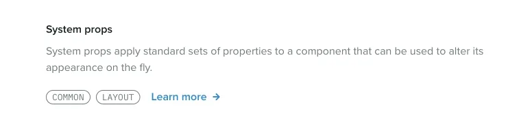
When developers first hover over these groups, their faces light up when they realize how much power is baked into our components. The system props let them compose UI in half the time, without having to write any CSS. Most importantly, system props make it laughably easy for developers to use our design tokens. When the most consistent thing is also the easiest thing, developers don’t have to break out of the system to get their work done, and you end up with a much more consistent experience.
What’s next
Getting our component library integrated with our design system is really just the beginning for us. If we were thinking in terms of version numbers, we would say that our system is now at version 1.0.0, which means there is plenty of room to grow. Here are some things we are focusing on next:
- Education in the form of workshops with the web developers and product designers on our team. New things come with a learning curve, and we want to make sure we are supporting our users by helping them understand the tool we have created.
- Reliability in the form of visual snapshot testing for our components. We want to be able to release updates to our component library with confidence that we aren’t breaking anything for anyone. We already unit test our components, but we will be working to integrate visual tests so we can ensure our components stay pixel perfect when we make changes.
- Expanding our offering by adding more components and continuing to document existing ones. We are just getting started with what our library offers, and we want to increase contribution to our system from engineers who are not directly involved with the projects. In addition, we are updating documentation as we go in response to commonly asked questions and use cases presented by our users.
All of this work will happen in parallel with the primary task of our design systems team — taking care of people. This piece has touched on a lot of the flashy artifacts of our system, but a majority of the work happens in Slack channels, Google Doc comments, and conversations with our team. Our system doesn’t mean anything without a diverse culture of collaboration and contribution that ensures we’re accurately representing our product and teams.
Finally, it’s important to note that we didn’t do any of this work in a vacuum. I want to highlight a few people and projects that have helped us get to where we are now:
- The GitHub Primer team has heavily influenced the technical direction of our system. Specifically Emily Plummer’s work on their React component library (we basically modeled our system after Primer). Thank you to the Primer team for doing all of your work in the open — people are watching and we are so grateful.
- The folks behind MDX and it’s accompanying plugin for Gatsby, gatsby-mdx. Extra thanks to Chris Biscardi (the creator of gatsby-mdx) for fielding my many questions as we worked to adopt MDX in our Gatsby site in the early days of the plugin.
- Max Stoiber for Styled Components, and Brent Jackson for Styled System. They making building component libraries a joy.
- Netlify for hosting our system, and Algolia for generously powering our search via their DocSearch product.
If you want to learn more about the design systems team at Sprout Social or what we’re up to, feel free to reach out to me on Twitter @chase_mccoy or email our team at designsystems@sproutsocial.com. And of course, you can check out our design system, Seeds, at seeds.sproutsocial.com.
Gatsby schema customization is pretty cool
Today on their blog, Gatsby announced the release of new schema customization APIs in version 2.2.0.
I’ve been using these new APIs in the alpha release on my site for a bit now, and I’ve come to realize how great they are thanks to an example by Jason Lengstorf. He uses the new APIs to create a generic blog schema, and then creates nodes based on data from multiple sources.
This is brilliant because it means your UI can be completely agnostic of where your data is coming from. Jason’s example sources data from multiple file types locally and creates a set of generic nodes that represent a blog post. The query to get the data you need to populate your UI is very clear:
allBlog(sort: { fields: date, order: DESC }) {
  nodes {
    title
    date
    content
  }
}
I adapted my site to do the same things, but in my case I am sourcing most of my data from WordPress, and also pulling in MDX files locally. This solves a big issue I had been facing — how could I merge and sort data from many sources by a common factor (like a date field) in a way that is abstracted from the UI code of my site. This totally solves that.
What’s great is that, as long as my schema doesn’t change drastically, I can feed in as many data sources as I want in the future and I will never have to change any of my queries or UI to support the new data sources. That’s a huge win especially when you consider the upcoming themes feature, which allows us to abstract away parts of our sites (configurations, data sources, UI, etc) entirely. These new APIs paired with themes is next level.
Congrats and terrific work to all the contributors over at Gatsby that made this possible. It’s incredible how easy it’s becoming to build great developer experiences on top of Gatsby.