I’m fascinated by the way that CSS, as it becomes more powerful, can be used as a visual language for representing the physical world. Combined with the longevity of the web, which strives to never break backwards compatibility, it’s a powerful tool for sending information into the future.
I grew up dreaming about the esoteric user interfaces seen in science fiction films, many of which featured circular screens, control panels, and UIs. Now we can achieve those with CSS!
I also love the whimsical nature of Orbit’s API, which requires a single “big bang” element on the page, and uses a “gravity-spot” class for creating an area with a radial layout. The library comes with support for adding orbits, slices, satellites, capsules, and more around user-defined gravity spots.
Wherever I can I prefer to work in the browser vs. tools like Figma. As the web platform grows (we seem to be in a sort of golden age at the moment) it becomes easier and easier to do my job with only the raw materials of the web.
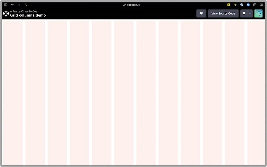
Recently I’ve been working on a project at the day job that requires the use of something akin to layout grids in Figma. I was curious how difficult it would be to recreate this on the web.
It took longer than I’d like to admit to figure out the math, but with a single repeating-linear-gradient we can overlay a representation of our grid onto the page. I whipped up a class for this with support for specifying your own number of columns and gutter width.
In the spirit of blogging the things I want to remember:
Slap that class onto your grid container and presto, you’ve got some rails in place to keep everything lined up nice and neat.
repeating-linear-gradient invokes strange powers
Once again I’m left marveling at the humble power of CSS, and feeling grateful that we live during times when such an expressive yet simple visual language is spoken so ubiquitously.