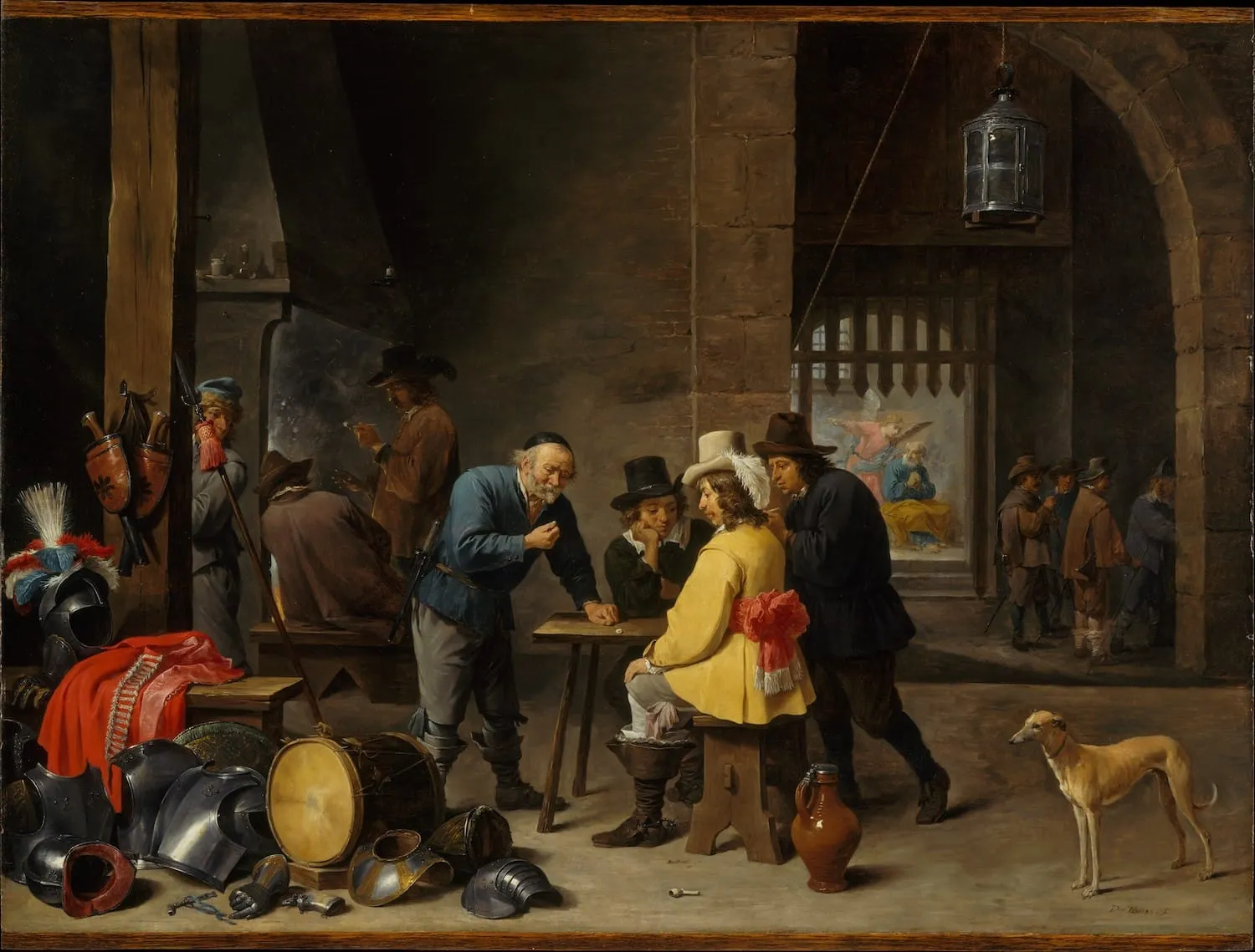
Autumn is my favorite time of the year. The trees outside my apartment here in Oak Park are shining gold, and the air is starting to feel crisp and cold. Sweater weather, if you will.
Besides the weather and foliage, the best part of the season may just be its rituals. One of my favorites is an annual rewatching of Over the Garden Wall, which is the coziest, most endearing television series I’ve ever seen.
If the show is to teach us anything, it’s that things are not always what they seem.
I’d be remiss if I didn’t link to this wonderful exploration of vintage postcards that share a vibe with OtGW from the blog Weird Christmas (which is written by, get this, Craig Kringle). The entire site is dedicated to vintage Victorian Christmas cards, which Craig collects and shares online.
A few of the show’s scenes appear to take almost direct inspiration from some of the postcards in Craig’s collection. There is truly nothing new under the sun.
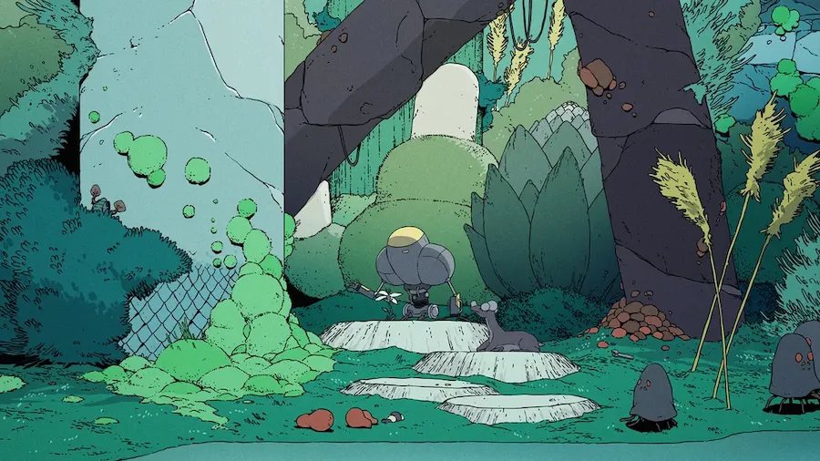
I recently discovered that a new animated series on HBO Max, Scavenger’s Reign, is based upon an animated short which appeared online 4 years ago by Joe Bennett and Charles Huettner.
The short caught my attention when it originally released for being a beautiful and wholly original bit of science fiction. Sometimes the internet, like the world, is full of serendipity, and you might rediscover something familiar just like you might stumble into an old friend at a crowded place.
The first six episodes have already premiered, and I’m hooked already. The style is something like a cross between Fantastic Planet, Sable, and Nausicaä of the Valley of the Wind.
I am such a sucker for any media that takes world building seriously, and the world of Scavenger’s Reign is overflowing with details—flora, fauna, and environments as alien as you’ve ever seen. The ecology of Vesta Minor, the planet on which the show takes place, is just as much a character as the humans stranded there.
Since there seems to be an animation theme going here, I’ll briefly mention how excited I am for the upcoming animated Scott Pilgrim series on Netflix: Scott Pilgrim Takes Off. I have a love for both the graphic novels and the 2010 film, whose cast will be returning to voice the characters in the new series.
Robin Sloan recommended the book Ghosts and Demons of India in his latest newsletter, and I picked up a copy of my own just in time for Halloween.
I love books that can be imbibed in small sips like a hot cup of coffee. Ghosts reads like an encyclopedia of creatures and spirits from the Indian subcontinent, and each entry conjures up the most vivid images. I have no idea the pantheon of ghost stories in India was so vast!
Allow me to recommend one of my favorite blogs of late, which excites me every time it appears in my RSS reader. It is the wonderful Going Medieval by Dr. Eleanor Janega, who specializes in “late medieval sexuality, apocalyptic thought, propaganda, and the urban experience in general.” How cool is that??
Dr. Janega uses their expertise to make comparisons and critiques between modern internet culture and that of medieval societies. One of their latest posts was sparked by the recent national test of the Integrated Public Alert and Warning System (IPAWS) on October 4 in the United States, which caused everyone’s smartphones to scream in unison. If you’re like me, you found it surprising and terrifying despite the numerous warnings online in the weeks leading up to the test.
Some folks found it more than surprising, though, and used it as the basis for conspiracy theories related to 5G, vaccines, viruses, and the like.
We often like to think of medieval European societies as unenlightened, unintelligent, and superstitious, but Dr. Janega reminds us that we’re not much better ourselves. Many bogus explanations were offered for the Black Death, and the parallels with how people respond to public health emergencies today are eery.
Definitely go read the whole piece, it’s full of gems like this:
I have repeatedly heard people now refer to the fact that “medieval streets were full of shit” to explain the spread of the Black Death. This is interesting because it is 1) not true – most medieval cities tightly regulated the disposal of human waste very strenuously and 2) would be irrelevant anyway even if it were true (it’s not) because that’s not how yersinia pestis travels.
So I’ve never seen myself as a designer or engineer or writer, but as a third thing. It’s sort of pompous and silly to call myself this word though, so I avoid it, but deep down it’s what I’m always thinking whenever someone asks what I do. But here, in this secret society of the newsletter, I will admit to you:
I’ve always seen the browser as a printing press.
Because of that, I’ve always seen myself as a publisher first and then everything else second.
I couldn’t agree more. The power of the browser is not that it gave us the ability to write or create art or build programs, but that it allowed anyone to publish those things to the entire world.
The application of the web—design, engineering, writing—are all interests of mine, but for me they’re inevitably second to the printing press itself.
Speaking of Robin, be sure to check out his latest newsletter, The Cascade which focuses on the past, present, and future of CSS. Robin has been exploring new color features in CSS in the latest issues and it’s been a delight to follow along with.
In the spirit of publishing, I’ve been working on a little side project that is an ode to the written word.
While I appreciate the convenience of ebooks and audio books, I have always preferred to own and read physical copies. As a result, I’ve accumulated quite a few books that are becoming increasingly difficult to store and move around. I know at some point I’ll need to slim down my collection, but I wanted to preserve it in its current form.
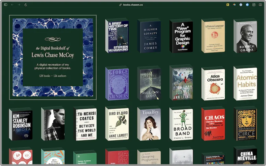
To that end, I decided the place to start would be creating a database of all the books in my physical collection. I spent a few weeks inputting titles, authors, dates, ISBN numbers, page counts, and more metadata about the titles on my shelves. I still have a few boxes of books to go through and log, but most of my collection is now captured digitally.
I decided to use Airtable for this job, partly because it has such an easy to use API. I wanted to display my collection in a way that was more pleasant to browse than a spreadsheet, so I built my own little frontend for the database.
It’s still very much a WIP, and not as performant as I’d like it to be just yet, but you can take a peek at books.chasem.co
A website can be a bookshelf
Now I feel much more comfortable donating some of my books knowing that I’ll always be able to look back over my collection.
I hope this season find you well. With reverence to the Great Pumpkin,
I can think of 3 obvious reasons why this might all be happening now as opposed to any time over the past decade:
The content on social media platforms is valuable for AI training, and platforms want to capitalize on or keep that value for themselves.
The recent, high-interest-rate environment has companies cutting costs in ways they might not before, and subsidizing API access for third party developers is no longer a bill they’re willing to foot.
The bad behavior of platforms is creating a more competitive environment as new challengers spring up (Bluesky, Posts, Mastodon, and Threads all come to mind).
Those seem obvious, but are they really the cause? Is it one more than the other? Or something else entirely?
I wonder how much of this trend is really just a domino effect of CEOs realizing that they can get away with screwing over their users because they saw Elon Musk (or some other robber baron) get away with it.
Humane (the mysterious company founded by ex-Apple executives) has finally revealed the name of the product they’re hoping to ship this year: the Humane Ai Pin.
I’m as skeptical as the next person about AI and wearables and really anything with as much hypebeast marketing as this product has received. But if I put my skepticism aside for a moment I’m able to appreciate this for what it is—a group of people trying to create a new kind of computer and computing paradigm.
There’s a bit of footage out there of the device in action, but regardless of the specifics I think it’s essential that we never stop asking ourselves what a computer could or should be.
The problem was, you can’t ask Aristotle a question. And I think, as we look towards the next fifty to one hundred years, if we really can come up with these machines that can capture an underlying spirit, or an underlying set of principles, or an underlying way of looking at the world, then, when the next Aristotle comes around, maybe if he carries around one of these machines with him his whole life—his or her whole life—and types in all this stuff, then maybe someday, after this person’s dead and gone, we can ask this machine, “Hey, what would Aristotle have said? What about this?” And maybe we won’t get the right answer, but maybe we will. And that’s really exciting to me. And that’s one of the reasons I’m doing what I’m doing.
For all the work we’ve put into creating ways to capture our lives digitally, it doesn’t feel like the ritual of passing that information down to future generations is considered much.
I wonder if this might be a common use case for conversational AIs in the future. You can imagine a ChatGPT trained on the works of Aristotle, waiting to answer new and novel questions. Like Steve says, we won’t always get the right answer, but maybe we will.
The digital book is lovely and full of wisdom—definitely a recommended read.
It’s hard to keep up with the progress of AI. It seems as though every week there’s a new breakthrough or advancement that seemingly changes the game. Each step forward brings both a sense of wonder and a feeling of dread.
This past week, OpenAI introduced ChatGPT plugins which “help ChatGPT access up-to-date information, run computations, or use third-party services.”
Though not a perfect analogy, plugins can be “eyes and ears” for language models, giving them access to information that is too recent, too personal, or too specific to be included in the training data.
A web browser plugin which allows the AI gather information from the internet that was not originally part of its training corpus by searching the web, clicking on links, and reading the contents of webpages.
A code interpreter plugin which gives ChatGPT access to a sandboxed Python environment that can execute code as well as handle file uploads and downloads.
Both of these plugins are pretty astonishing in their own right, and unlock even more potential for AI to be a helpful tool (or a dangerous actor).
But what caught my eye the most from OpenAI’s announcement is the ability for developers to create their own ChatGPT plugins which interact with your own APIs, and more specifically the way in which they’re created.
Here’s how you create a third party plugin:
You create a JSON manifest on your website at /.well-known/ai-plugin.json which includes some basic information about your plugin including a natural language description of how it works. As an example, here’s the manifest for the Wolfram Alpha plugin.
You host an OpenAPI specification for your API and point to it in your plugin manifest.
That’s it! ChatGPT uses your natural language description and the OpenAPI spec to understand how to use your API to perform tasks and answer questions on behalf of a user. The AI figures out how to handle auth, chain subsequent calls, process the resulting data, and format it for display in a human-friendly way.
And just like that, APIs are accessible to anyone with access to an AI.
Importantly, that AI is not only regurgitating information based on a static set of training data, but is an actor in and of itself. It’s browsing the web, executing code, and making API requests on behalf of users (hopefully).
The implications of this are hard to fathom, and much will be discussed, prototyped, and explored in the coming months as people get early access to the plugin feature. But what excites me the most about this model is how easily it will allow for digital bricoleurs to plug artificial intelligence into their homemade tools for personal use.
Have a simple API? You now have the ability to engage with it conversationally. The hardest part is generating an OpenAPI spec (which is not very hard to do, it’s just a .yaml file describing your API), and you can even get ChatGPT to generate that bit for you. Here’s an example of someone successfully generating a spec for the Twilio API using ChatGPT.
It seems to me that this will greatly incentivize companies and products to create interfaces and APIs that are AI-friendly. Consumers will grow to expect AI tools to be able to interface with the other digital products and services they use in the same way that early iPhone users expected their favorite websites to have apps in the App Store.
There are certainly many negative and hard-to-predict consequences of opening up APIs to AI actors, but I am excited about the positives that might come from it, such as software products becoming more malleable via end-user programming and automation.
Don’t want to futz around with complex video editing software? Just ask your AI to extract the first 5 seconds of an MP4 and download the result with a single click. This type of abstraction of code, software, and interface will become ubiquitous.
But when you consider that ChatGPT can write code to build GUIs and can even interact with them programmatically on a user’s behalf, the implications become clear. Everyone will benefit in some way from their own personal interface assistant.
I wonder also how many future products will be APIs only with the expectation that AIs are how users will interact with them?
Simon Willison wrote a great blog post demonstrating this. He wired up a ChatGPT plugin to query data via SQL, and the results, though technically returned as JSON, get displayed in a rich format much more friendly for human consumption.
I wonder if future “social networks” might operate simply as a backend with a set of exposed APIs. Instead of checking an app you might simply ask your AI “what’s up with my friend Leslie?” Or you could instruct your AI to put together a GUI for a social app that’s exactly to your specification.
It would be interesting to try this today with good old RSS, which could be easily wired up as a ChatGPT plugin via a JSON feed. Alas, I don’t yet have access to the plugins feature, but I’ve joined the waitlist.
I’m both excited and nervous to see what happens when we combine AI with a medium like the web.
I’m finally getting around to playing Ghost of Tsushima which is impressive all around. But the thing that has impressed me most is… wind??
The game rejects the normal interface of a minimap to guide players, and instead uses the wind and the environment to show the way forward.
When The Guiding Wind blows in Tsushima, the entire game world responds. The trees bend over, pointing you onward. The pampas grass ripples like the surface of water. Leaves and petals swirl around the scene. The controller emits the sound of gusting wind, and the player can swipe the touch pad to blow the winds and set the environment in motion.
Such a simple mechanic is so unexpected and beautiful and calming in a world of cutting edge graphics and 4K 60FPS VR madness. Video games (and everything else) today are so over the top, but in the end it’s something simple like the wind that gets you.
For a while now I’ve been saying that science fiction works by a kind of double action, like the glasses people wear when watching 3D movies. One lens of science fiction’s aesthetic machinery portrays some future that might actually come to pass; it’s a kind of proleptic realism. The other lens presents a metaphorical vision of our current moment, like a symbol in a poem. Together the two views combine and pop into a vision of History, extending magically into the future.
I read that and then, a day later, stumbled upon a thought experiment published on the wonderfully quirky website of Ville-Matias Heikkilä.
The thought experiment, titled “Inverted computer culture”, asks the reader to image a world where computing is seen “as practice of an ancient and unchanging tradition.”
It is considered essential to be in a properly alert and rested state of mind when using a computer. Even to seasoned users, every session is special, and the purpose of the session must be clear in mind before sitting down. The outer world is often hurried and flashy, but computers provide a “sacred space” for relaxing, slowing down and concentrating on a specific idea without distractions.
What a dream. I encourage you to read the piece which is quite short. It struck me as being exemplary of the aforementioned double action of science fiction—both a vision of the future and a metaphor for the current moment. You can imagine how a fictional immune response to our current culture might drive us toward a world of computing and technology like the one imagined here.
To push it a bit further, I prompted ChatGPT to write a story based on the thought experiment and threw the result into a gist. You can read the story it came up with here.
The story’s alright, but the last paragraph is something else. It captures so many of the feelings I have about computing and the web:
As she sat there, lost in her work, she knew that she would never leave this place, this sacred space where the computers whispered secrets to those who knew how to listen. She would be here always, she thought, a part of this ancient tradition, a keeper of the flame of knowledge. And in that moment, she knew that she had found her true home.
I have a lot of nostalgia for the era of blogging that I grew up with during the first decade or so of the 2000s.
Of course there was a ton of great content about technology and internet culture, but more importantly to me it was a time of great commentary and experimentation on the form of blogging and publishing.
As social media and smartphones were weaving their ways into our lives, there was a group of bloggers constructing their own worlds. Before Twitter apps and podcast clients became the UI playgrounds of most designers, it was personal sites and weblogs that were pioneering the medium.
Looking back, this is probably where my meta-fascination with the web came from. For me the most interesting part has always been the part analyzing and discussing itself.
Robin Sloan puts it well (as he is wont to do):
Back in the 2000s, a lot of blogs were about blogs, about blogging. If that sounds exhaustingly meta, well, yes — but it was also SUPER generative. When the thing can describe itself, when it becomes the natural place to discuss and debate itself, I am telling you: some flywheel gets spinning, and powerful things start to happen.
Design, programming, and writing started for me on the web. I can recall the progression from a plain text editor to the Tumblr theme editor to learning self-hosted WordPress.
All of that was driven by the desire to tinker and experiment with the web’s form. How many ways could you design a simple weblog? What different formats were possible that no one had imagined before?
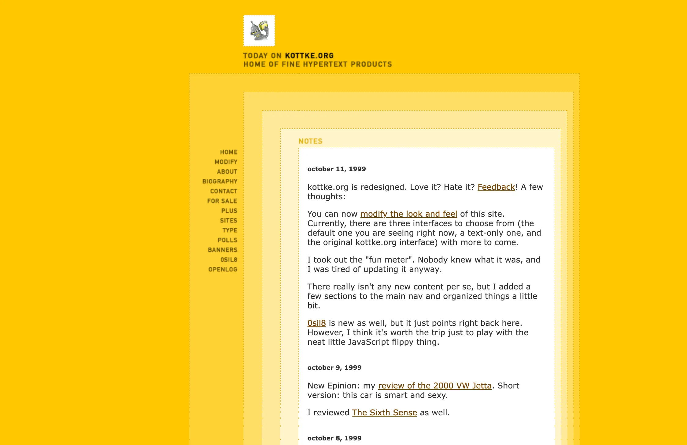
Earlier this week I listened to Jason Kottke’s recent appearance on John Gruber’s podcast and was delighted to hear them discuss this very topic. Jason is one of the original innovators of the blog form, and I’ve been following his blog, kottke.org, since I was old enough to care about random shit on the internet.
Kottke.org turned 25 years old this week, and Jason has been publishing online for even longer than that. All along the way, he has experimented with the form of content on the web. He’s not alone in that—many bloggers like him have helped to mold the internet into what it is today. The ones that influenced me besides kottke.org are Daring Fireball, Waxy.org, Jim Coudal and Coudal Partners, Shawn Blanc, Rands in Repose, Dave Winer, and more that I’m certainly forgetting.
Jason and John have an interesting conversation during the podcast (starting around 25 minutes in) about how the first few generations of bloggers on the web defined its shape. Moving from print to digital mediums afforded a labyrinth of new avenues to explore.
It’s always important to remind ourselves that many of the things we take for granted today on the web and in digital design had to be invented by someone.
Early weblogs did not immediately arrive at the conclusion of chronological streams—some broke content up into “issues”, some simply changed the content of their homepages entirely.
It wasn’t until later that the reverse-chronological, paginated-or-endless scrolling list of entries was introduced and eventually became the de-facto presentation of content on the web. That standard lives on today in the design of Twitter, Instagram, etc., and it’s fascinating to see that tradition fading away as more sites embrace algorithmic feeds.
By the way, I’d be remiss here if I didn’t mention Amy Hoy’s amazing piece How the blog broke the web. Comparing the title of her piece with the title of this one, it’s clear that not everyone sees this shift in form as a positive one, but she does a great job in outlining the history and the role that blogs played in shaping the form of the web. Her particular focus on early content management systems like Movable Type is fascinating.
Another great example that Jason and John discuss on the podcast is the idea of titling blog posts.
They point out that many early sites didn’t use titles for blog posts, a pattern which resembles the future form of Tweets, Facebook posts, text messages, and more. But the rise of RSS readers, many of which made the assumption that entries have titles and design their UIs around that, forced many bloggers to add titles to their posts to work well in the environment so popular with their readers.
Jason mentions that this was one of the driving factor for kottke.org to start adding titles to posts!
This is an incredible example of the medium shaping the message, where the UI design of RSS readers heavily influenced the form of content being published. When optimizing for the web, those early bloggers and the social networks of today both arrived at the same conclusion—titles are unnecessary and add an undue burden to publishing content.
This difference is the very reason why sending an email feels heavier than sending a tweet. Bloggers not using titles on their blog posts figured out tweeting long before Twitter did.
When referring to the early bloggers at suck.com, Jason said something that I think describes this entire revolution pretty well.
[…]there was in information to be gotten from not only what they linked to, but how they linked to it, which word they decided to make the hyperlink.
It’s not often that you have an entirely new stylistic primitive added to your writing toolbox. For decades you could bold, italicize, underline, uppercase, footnote, etc. and all of a sudden something entirely new—the hyperlink.
With linking out to other sites being such a core part of blogging, it’s no surprise that the interaction design of linking was largely discussed and experimented with. Here’s a post from Shawn Blanc discussing all the ways that various blogs of the time handled posts primary geared towards linking to and commenting on other sites.
Another similar example is URL slugs—the short string of text at the end of a web address identifying a single post. For many of my favorite bloggers, the URL slug is a small but subtle way to convey a message that may or may not be the same as the message of the post itself. One other stylistic primitive unique to the web.
The different ways in which bloggers designed their site or linked to words became a part of their unique style, and it gave their each of them an entirely new way to express themselves.
It’s hard to communicate how grateful I feel for this era of experimentation on the web, and specifically for Jason Kottke’s influence on me as a designer. The past 25 years have been a special time to experience the internet.
There was a time when I thought my career might be curved towards blogging full-time and running my own version of something like kottke.org. Through exploring that I found my way to what I really loved—design and software. My work continues to benefit from what I learned studying bloggers and publishers online.
Whether you care much about writing or not, I encourage you to have a blog. Write about what interests you, take great care of how you present it to the world, and you might be surprised where it takes you. There are new forms around every corner.
The recent fad of the metaverse is all about digitizing the physical world and moving our shared experiences (even more so) onto the internet.
I wonder what an opposite approach might look like—one where, instead of making the physical digital, we instead attempt to bring the online world into our physical spaces (and no, I don’t remotely mean AR or VR).
The first thing that comes to mind for me is Berg’s now-defunct Little Printer project from back in 2012 or so. Little Printer was a web-connected thermal printer that lived in your home and allowed you to receive print-outs of digital publications, your daily agenda, messages from friends, etc.
Little Printer was an attempt at bridging the physical and digital, essentially creating a social network manifested as a physical object in the home and consumed via paper and ink.
Personal websites are the digital homesteads for many. Those sites live somewhere on a web server, quietly humming away in a warehouse meant to keep them online and secure. For each of us those servers represent empty rooms waiting to be decorated with our thoughts, feelings, interests, and personalities. We then invite strangers from all over the world to step inside and have a look.
Like the Little Printer, I wish that my web server could exist in my home as a physical object that could be touched, observed, and interacted with.
Hosting a web server yourself is surprisingly difficult today given the advances we’ve made in consumer technology over the last few decades. Hosting content on someone else’s server has become as simple as dragging and dropping a folder onto your web browser. There are countless business that will happily rent out online space to for very cheap (or even free, with the hopes that eventually you’ll upgrade and give them money).
We’re all tenants of a digital shopping mall, sharing space controlled by corporate entities who may not share our values or interests.
When someone visits my website, I wish it could feel more like inviting them into my home. What if my website lived in my home with me?
Imagine if having a web server in the home was as common as any other appliance such as a refridgerator. You might look over and see your friend (or a welcome stranger!) browsing your website. You could see what they’re browsing—look at photos with them, listen to a song together, whatever—and start a conversation about any of it.
Ever since we’ve decided that servers are something heavy, enigmatic, gigantic black boxes belonging to corporations - not individuals - we have slowly lost agency towards our own small space on the Internet. But actually, servers are just computers. Just as your favorite cassette player or portable game console, they are something that you can possess and understand and enjoy.
It is boundary-violating, to have a website in the corner of your bedroom. Websites are meant to be in the cloud. Eternal, somehow, transcendent, like the voice of code floating down from the sky. But no, there it is. It is real! I can kick it! Argumentum ad lapidem.
Those fixated with the idea of the metaverse might are interested in bringing real-world objects into the cloud. I wonder instead how we might try to bring objects from the cloud into the real world and into our homes. How would we design webpages differently if our materials included the servers that they’re hosted on?
I remember the first time I saw a Mac in person. I was in middle school, but on the campus of the nearby college because my dad had a gig as a stand-in drummer for a local band.
While hanging out backstage—something I often had the privilege of doing from a young age as the son of a drummer—I saw a girl, sitting on the ground, typing away on a brand new MacBook Air.
The Air had just been introduced to the world, and I remember rewatching the announcement video online. Steve Jobs talked about the computer at Macworld only to reveal that it had been on stage with him the entire time inside a manilla envelope. He opened it and pulled out the thinnest computer in the world. I had no idea a computer could even look like that.
After my dad’s show I immediately pointed out the girl and her computer, and I remember him sharing my excitement so much that he asked the girl if we could look at it a bit closer. She was kind and happy to show it off and even let me hold it. From then on, I was hooked. I knew that’s the computer I’d own one day, and sure enough I’d get my first Mac, a MacBook Air, a few years later in high school.
And now Apple has introduced a MacBook Air thinner than the original iPhone. I wonder what middle school me, who coveted but did not own an iPhone at the time, would think about that.
I received the new M2 MacBook Air (in Midnight) a few months ago and I’ve been smitten with it. It is a cool, dark slab of silent compute, and it feels dense and book-ish in the most satisfying way.
The battery life deserves its own mention, and feels like a leap ahead for personal computers in its own right.
In all honesty I thought the time had come when a computer could not longer really excite me in the way that original MacBook Air did. But, this new one takes me right back there. It reminds me how lucky we all are to carry around devices that can conjure up all sorts of magic. And it takes me back to my beginnings in software when people wrote about the design of new iOS and Mac apps like they were art critics.
My life and friends and relationships and career are all in there, wound up with the electrons.
In setting up and using this new computer for the first time, however, I’ve realized how much devices today are like shells. The real computers, the ones that store our data and perform tasks on our behalf, are behemoths sitting in data centers. Setting up a new computer today is mostly a task of signing into various web applications to access your data, not transferring data onto the machine itself.
Our computers have become internet computers. And that might mean that the physical devices we own will trend towards nothingness—their goal is no longer to impress or inspire, but to be so small and light as to fall away entirely.
There’s something about that which makes me feel a bit melancholy. It feels like the days of computing devices being objects with personality and conviviality are fading. The computer is no longer a centerpiece, it’s an accessory, a thin client for some other machine or machines which are hidden away from us.
Since I was a kid the space program has been an object of my fascination, and even as an adult I’ve been captured by the heroics of NASA and other organizations launching probes and telescopes into the far reaches of space.
But something has never sat quite right with me about the recently renewed interest in human space travel, especially from CEOs of private companies like Musk and Bezos.
I think it’s always been a combination of two things:
There are so many problems here on Earth, many of which could be solved with the resources being invested into sending humans to another world.
Wherever you stand on the matter, whether you’re a Musk fanboy, an unaligned Mars obsessive, or just biplanetary/curious, I invite you to come imagine with me what it would take, and what it would really mean, for people to go put their footprints in the Martian sand.
Maciej does a great job explaining just how bad and nonsensical of an idea it is to send humans to Mars.
As much as I love media about humans traveling to the red planet (The Martian and For All Mankind come to mind), perhaps it’s best that fantasy lives on solely as part of our imagination for now.
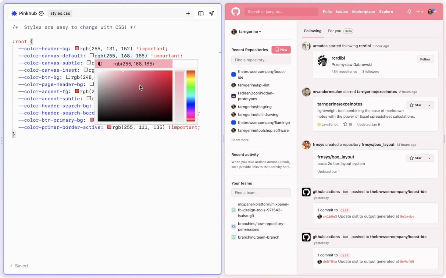
Boosts are a reinvention of browser extensions—a built-in way to boost the web by writing your own code (HTML, JavaScript, and CSS) that can run on any website or specific ones that you assign. Check out this example of applying custom styles to GitHub:
Look at that! The webpage on the right is the canvas, and the code on the left is the medium. They’ve even built in visual editing tools such as a color picker.
Webpages have always been destinations, but this invites them to be starting points—blank canvases, even. Your browser now invites you to extend and reimagine the web in whatever way you see fit.
It has always been possible to run user scripts and styles via browser extensions, but the developer experience of creating an extension has never been particularly beginner friendly. I’ve personally never seen extension development integrated so seamlessly and directly into the browser. Arc even implies that working with the web might be just as important as browsing it—in Arc’s interface, the Boost editor sits at the same level as the page you’re browsing, not in some nested panel that feels secondary to the experience.
Under the hood, Boosts are just a folder of HTML, JS, and CSS files. You can zip them up and send them to a friend, if you’d like. One can imagine a way to easily share boosts on the web in some sort of marketplace built right into Arc. There could be entire forums dedicated to sharing boosts around like Winamp skins for websites.
Boosts empowers even non technical users to create with the web rather than simply consuming it. The possibilities are exciting, and it’s refreshing that they’re being explored by a startup in 2022 at all.
I’m interested in software that works for us, our creativity, and our attention. The web is a powerful building material with a variety of textures, and it’s time we had tools that let all of us take advantage of such an incredible resource.
From The Browser Company’s email to Arc beta members about Boosts:
So, what happens to the internet when changing the internet is this easy?
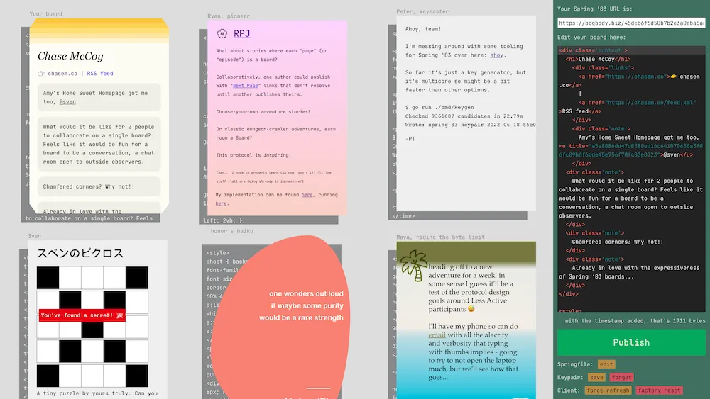
If you read any of my writing you know that Robin Sloan is one of my favorite internet thinkers. He’s just published a spec for a new web protocol he’s designed called Spring ‘83.
I’d encourage you to read the spec yourself and check out the demo client. Just look at it:
It’s just so wonderfully web-ish.
Robin frames this work around imagining alternative “ways of relating” across the internet. So many of our current ways of relating online (social media, RSS, email) do a create job of syndicating and delivering content, but they sacrifice the presentation of the content and in doing so lose a key piece of what makes the web so great: creativity, expression, and freedom.
I hadn’t thought about this much before, but subconsciously I’ve always been aware of it on some level because when I read RSS I much prefer to jump out to a person’s website rather than reading in the client. It feels more personal and imparts the voice of the author. Reading on the source website feels like stepping into someone’s home for a chat, whereas reading in an RSS client feels more… clinical.
It makes me dream of an RSS reader that could emulate the styles of the websites it’s syndicating. I’m reminded of a protocol-like idea from Kicks Condor called “whostyles” which is “a way of styling syndicated hypertext from other writers.”
Whostyles calls on website owners to make a chunk of CSS available at a well-known URL that others can embed into their sites to match the style of the original. If everyone implemented a whostyle for their site, an RSS client could use it to personalize the display of feed entries.
Spring ‘83 feels like it’s getting at these ideas, and it’s doing so by embracing HTML/CSS as a creative tool and a medium unto themselves.
A few things came across my desk this week that inspired hope about the future of the web and hypermedia as a medium.
No matter whether you consider yourself technical or not, it has never been easier to be creative with web technologies. Even the pain of setting up a local development environment has been abstracted away by code-in-the browser apps.
Why, then, have we not seen more people using the web as you might expect a layperson use a spreadsheet to assist with a myriad of tasks? The web goes far beyond just letting us organize and process information, it also lets us architect our own little palaces in the ether. It leaves space not just for data and numbers, but for our imaginations and interests.
Cristóbal Sciutto published an essay this past week about using the browser and the filesystem to visualize local media, and why others might want to build their own media environments. He calls these folk interfaces:
I think of these as folk interfaces, akin to the jigs one makes in wood-working. Divorced from grandiose ambitions of building comprehensive systems, it leads the programmer to directly engage with data. I hope this mode can paint the picture of software, not as a teleological instrument careening towards automation and ease, but as a medium for intimacy with the matter of our time (images, audio, video), yielding a sense of agency with what, to most, feels like an indelible substrate.
The spreadsheet might lend us the wonders of automation, but the web has romance. It lets us connect with what Cristóbal calls the “matter of our time” in a way that is much more human.
We’ve put the web in the hands of nearly everyone in society, but we’ve spent a depressingly small amount of time helping folks use the web as a building material.
If we want to empower the average web user to harness the power of the tools at their fingertips, it makes sense that we would start teaching the basic skills needed at a young age.
In the 90’s, a number of teenagers made Geocities sites, which awakened their interest in web development and taught them some basics of HTML, CSS and JavaScript. Many of these teens went on to become web developers. […] Later still, many teenagers learned these skills customizing their Tumblr.
Ah, this had me reminiscing of many late hours spent hacking in the Tumblr theme editor.
There is some interesting discussion in the thread about how approachable mature technologies can even be to the uninitiated:
It’s probably disappointing to see the path so many of us took closing up behind us, but to some extent is a normal process for a maturing profession. There aren’t really accessible DIY paths to auto mechanic, aviator, architect, or lawyer either, though there once were.
I think that this is one of the great challenges we face as the web matures. If we don’t maintain accessible DIY paths as a point of order, we’ll lose the spirit of what has made the texture of the web that we know today.
Building the web is better compared not to auto mechanics and architects, but to painters and artists. You don’t need to make painting your profession to enjoy it as a method of self expression, and the same holds true of the web and any other creative medium.
Art class in middle school should have days focused on CSS.
Finally, an example of something being done to keep this kind of folklore alive for the generations to come. Figma and Google announced a partnership whereby students using Chromebooks will have free access to Figma.
Access is core to Figma’s mission. By partnering with the Chromebook team, we are able to use our web-based roots to deliver collaborative design software to more students and educators inside and outside of the classroom.
This warms my heart in a way that is unusual considering Google is involved.
Figma is a powerful tool that, importantly, is made of the web. There’s quite a lot that a middle school Chase could have imagined up with an infinite, scriptable canvas like Figma.
When it comes to discovering the expressiveness of the web, Figma is a powerful gateway drug.
This week the team behind Stripe’s documentation launched Markdoc, the toolchain used internally to author and manage all of our docs. I’ve had the pleasure of working with this team and Markdoc internally at Stripe for some time, and I wanted to write a bit about why it’s such an exciting tool.
I have quite a bit of experience building content-heavy documentation sites for design systems, most of which have previously used MDX. MDX was a revolution due to the ease of use and familiarity of Markdown married with the power of being able to render arbitrary React components within your document. But in every MDX project I’ve worked on there have eventually been scaling and maintenance issues with closely marrying content/data and code.
Markdoc creates cleaner boundaries between your content and the code that powers and enriches it. If MDX is “docs as code” then Markdoc is “docs as data”. MDX gives authors the full power of JSX, whereas Markdoc requires maintainers to carefully consider the primitives that are exposed to authors, and how they are exposed. Markdoc includes tooling to validate that content has been authored correctly and according to spec, whereas MDX is a free-for-all.
Another benefit of Markdoc is that it doesn’t require abandoning Markdown to achieve customization. While I think some of this has been addressed in MDX v2, consider a case where you want to render a <ul> with a custom class name attached. In MDX, you need to bail out of Markdown and fall back to HTML or JSX:
# Some fancy list:<ulclass='fancy'><li>Item 1</li><li>Item 2</li><li>Item 3</li></ul>
With Markdoc, you can attach an annotation to Markdown elements while still using Markdown syntax:
This is a lot easier to maintain and also retains the value of a Markdown powered authoring environment—Markdown is easy to use, even for non-technical contributors!
There are a lot of other reasons to love Markdoc that I won’t get into here. I am a big fan of the tool (as a user, not just because I work at Stripe) and I’m leveraging it to build the documentation site for Stripe’s design system. Congrats to the Docs team for creating such a robust tool and for making it available to the world as an open source project.
This week I finally received my Playdate from the folks over at Panic, and it’s just as delightful as everyone knew it would be. The Playdate account on Twitter recently tweeted:
That link at the end is not of the hypertext transfer variety—it’s a link to a resource via the Gopher protocol, which is an early predecessor of and not alternative to the web as we know it today. Gopher is used by a very small few today, but that’s not to say it’s not thriving. There are beautiful and rich communities running on Gopher.
If you don’t have a Gopher client handy, here’s a link to the document on the web. It’s a short reflection by Panic co-founder Steven Frank on the Playdate finally shipping after years of work, and I recommend you give it a read.
This stood out to me:
Maybe not every piece of new tech has to be the all-singing, all-dancing conqueror of all tech that came before. Maybe it wouldn’t hurt to slow down for a moment and re-explore some of the genuinely good ideas that fell to the wayside as we hurtled headlong into our current future. Maybe hardware whose primary appeal does not hinge on being the absolute cutting edge won’t become landfill quite as quickly. Maybe crushing every competitor needn’t be the goal of every business. Maybe, just maybe, it is good for alternatives to popular ideas to exist.
I immediately thought of the recent swerve in front-end development back towards the platform and web standards. Tools like Remix, Astro, Eleventy and Deno lean not just into the technologies of the web but also the underlying principles. Turns out there are lots of fantastic ideas that we largely forgot about while chasing after the latest and greatest.
To echo Steven, maybe code whose primary appeal does not hinge on being the absolute cutting edge won’t become obsolete quite as quickly. Sustainability is derived from a deep understanding materials, mediums, and their histories.
Playdate doesn’t compete with traditional handheld game consoles in the same way that Gopher no longer competes with the Web—by not playing the game at all. They are projects that understand their medium and are satisfied with exploring their own tiny little corner of it. They know that it’s more important to have 1,000 true fans than millions of unengaged users.
What are some of the genuinely good ideas we let fall to the wayside during our time working on the web that we could re-explore?
I started my career building iOS apps, and made my way back to the web out of excitement for tools that were emerging at the time around component-based design and development. I remember feeling that the idea of encapsulating markup, styles, and behavior was so obvious, and I couldn’t believe at the time that there was no method for that built directly into the platform. If you wanted to build components for the web you needed to setup a complex toolchain and build process, which is very intimidating for beginners.
Me from 10 years ago trying to create a component-based website would have been overjoyed by the simplicity of this. I’m thankful for React et al. for changing the way we think about frontend development, but I’m even more thankful that future web developers will have a far more approachable (and lightweight) entry point to best practices.
Lately I’ve been thinking a lot about design systems documentation, and more importantly how we scale knowledge and best practices across a large team. Looking at most system documentation (including for the design systems I’ve built), you’ll see something that heavily resembles the documentation you might find for a standalone product or software library.
We’re used to writing and reading long, linear documents full of content structured from top-to-bottom. But I think that content is actually far more useful in small chunks that are individually addressable.
Design systems can offer products, and some of those may be software libraries, but a design system is not only a product or a library. Good systems are hyperobjects that capture decisions, language, patterns, history, and all of the things that make and have made your organization’s design what it is. They resemble knowledge graphs far more than products, and I’d like to see some of the emerging patterns around software for managing a knowledge graph applied to design systems.
The knowledge graph represents a collection of interlinked descriptions of entities – objects, events or concepts. Knowledge graphs put data in context via linking and semantic metadata and this way provide a framework for data integration, unification, analytics and sharing.
The best way to think about how a knowledge graph can be represented in software form is to look at tools like Roam Research, Obsidian, and to some degree (with their new synced blocks feature) Notion. There are also individuals experimenting with these concepts, such as Andy Matuschak’s personal notes
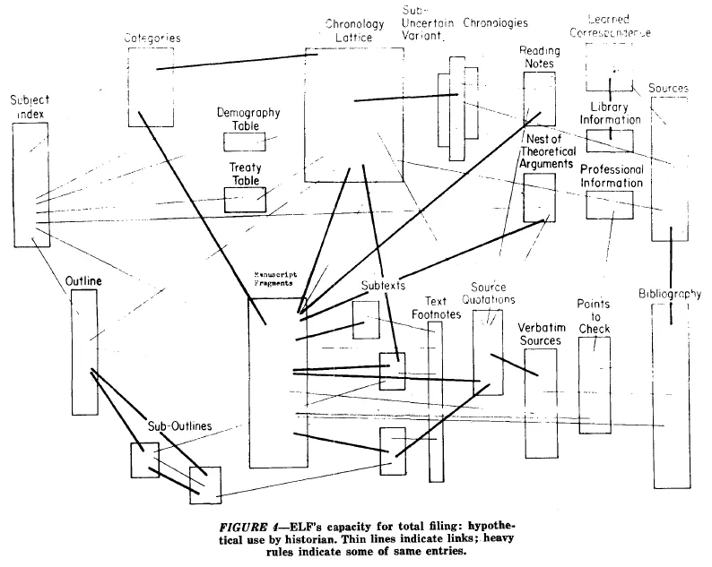
These tools pull from a long history of ideas that can tie their origins to the creation of hypertext itself. But the original vision of hypertext is not really like the hypertext of today’s web. Pioneers like Ted Nelson imagined a hypertext where links aren’t only one way, and where information can be referenced and embedded across many contexts. (By the way, Devon Zuegel did a wonderful interview with Ted Nelson for Notion.)
A diagram from Ted Nelson's original paper on hypertext, courtesy of the Museum of Media History
Unfortunately, we didn’t get Mr. Nelson’s vision for hypertext with the web. Many of the reasons documentation on the web today is so limited is due to the limitations of the medium itself. Despite that, there are tools and sites popping up that give us a look at some of these ideas implemented on the web.
Knowledge graph systems that make specific ideas addressable unlock some interesting ideas that I think could be applied to documentation (not only, but especially, for design systems).
Transclusion
When content is stored in its minimum viable format and can be referenced uniquely, it becomes possible to “transclude” or embed the content directly in whatever context you’d like.
Imagine all of the pieces of a design system that could individually encoded:
Styles
Tokens
Components
Patterns
Guidelines
Frameworks
Properties
Content
Icons
Illustrations
Wherever these concepts are mentioned in our document, they could instead be transcluded. This means that future updates to that information are propagated through our documentation rather than documents slowly becoming out of sync with one another.
Not to mention that linking these concepts rather than simply re-iterating exposes the structure and relationships in our system to the end user—by seeing how things relate, they get better at navigating the system in the future.
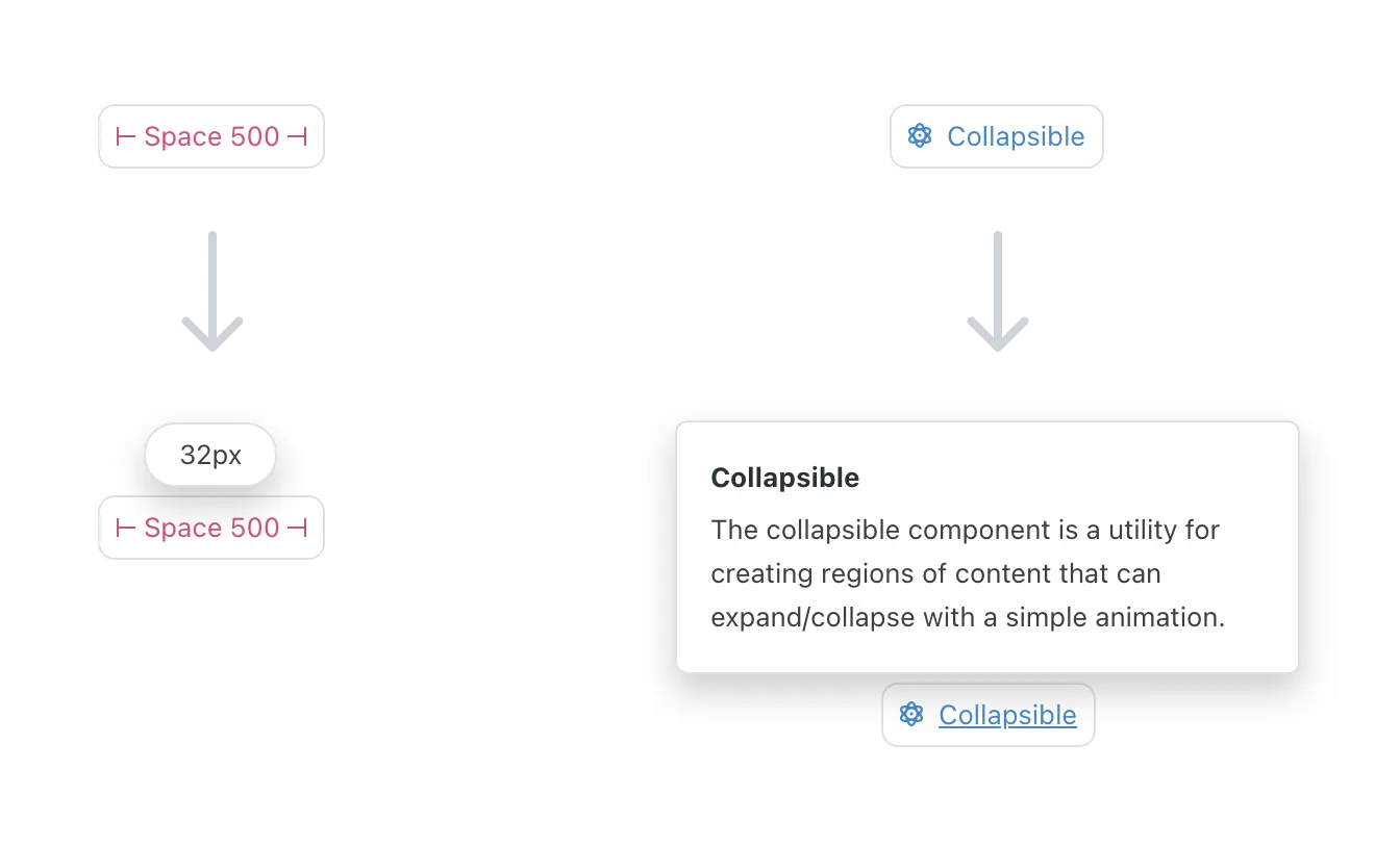
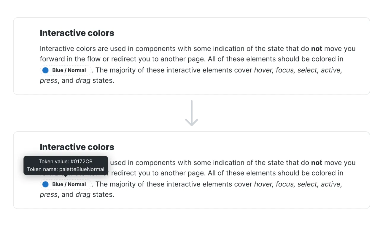
I’ve tried to integrate some of these concepts into design system documentation before, and I’ve seen other systems experiment with it as well. When I was working on the Seeds design system, we built embeddable tags for some of the concepts in our system like design tokens, components, and even specific props on components. When the user hovers over the tokens, they can learn get more information about them inline without switching contexts:
Whenever we updated one of these concepts in our system, we no longer needed to worry whether references throughout our docs would get updated as well. Other design systems have used this same idea. Here is a similar concept from Kiwi’s Orbit design system:
I think the idea could be taken even further, allowing not only simple values to be referenced but entire sections of content to be remixed and re-used throughout the knowledge graph.
Bidirectional links
Bidirectional links build on transclusion by making the original piece of content aware of where it is being referenced throughout the graph.
There are many ways in which bidirectional links would benefit a design system Consider a Button component, which imports and uses an Icon component. This dependency within the system resembles a link in a knowledge graph, and it should be bidirectional as well. If I view the documentation for Button, I want to see that it consumes Icon. And if I view the documentation for Icon, I want to see that it’s consumed by Button (and whatever other components).
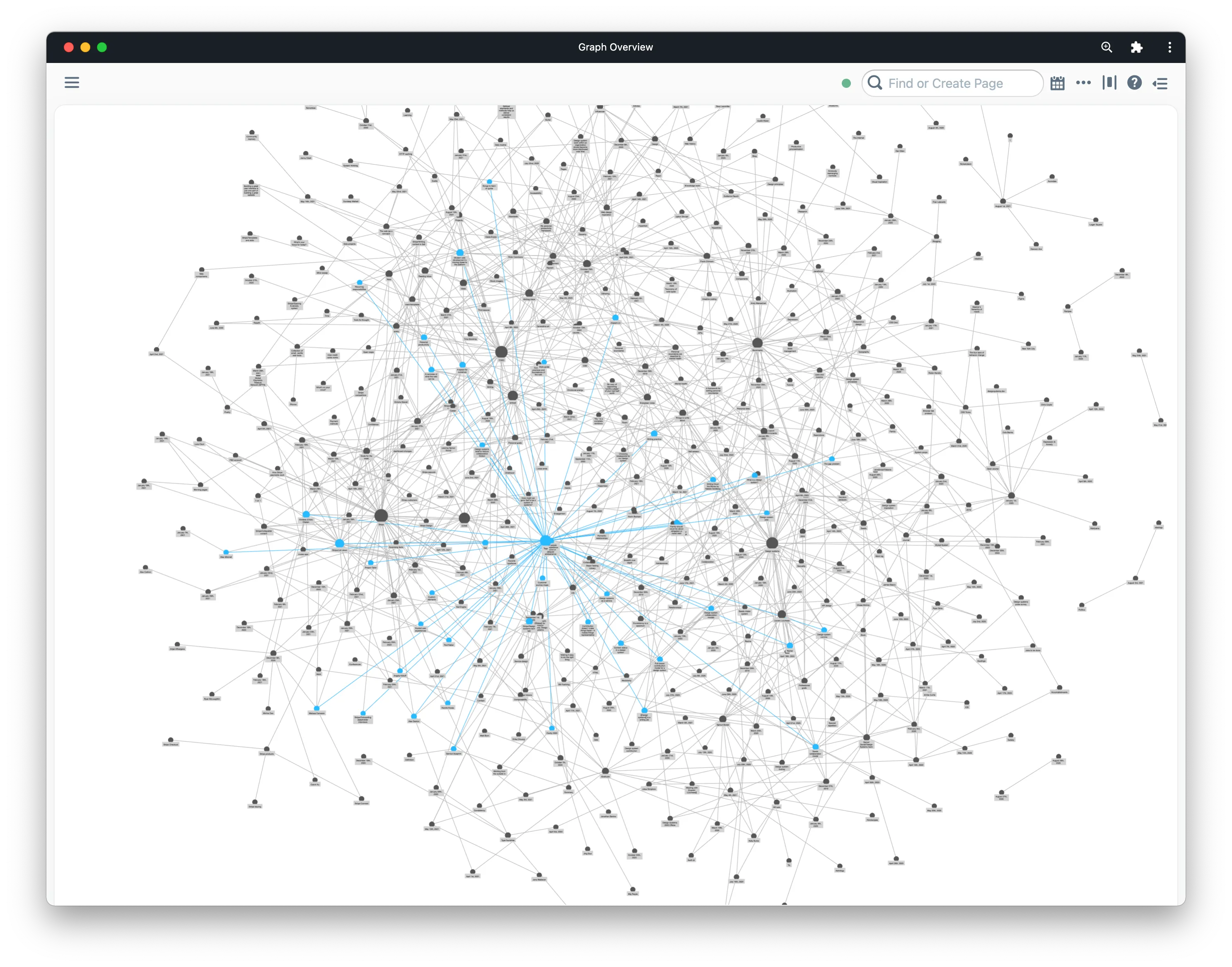
Bidirectional links would allow us to visualize the relationship between entities in our system in unique ways. The most obvious example of this is showing the graph as a graph, which is a hallmark feature of Roam and Obsidian.
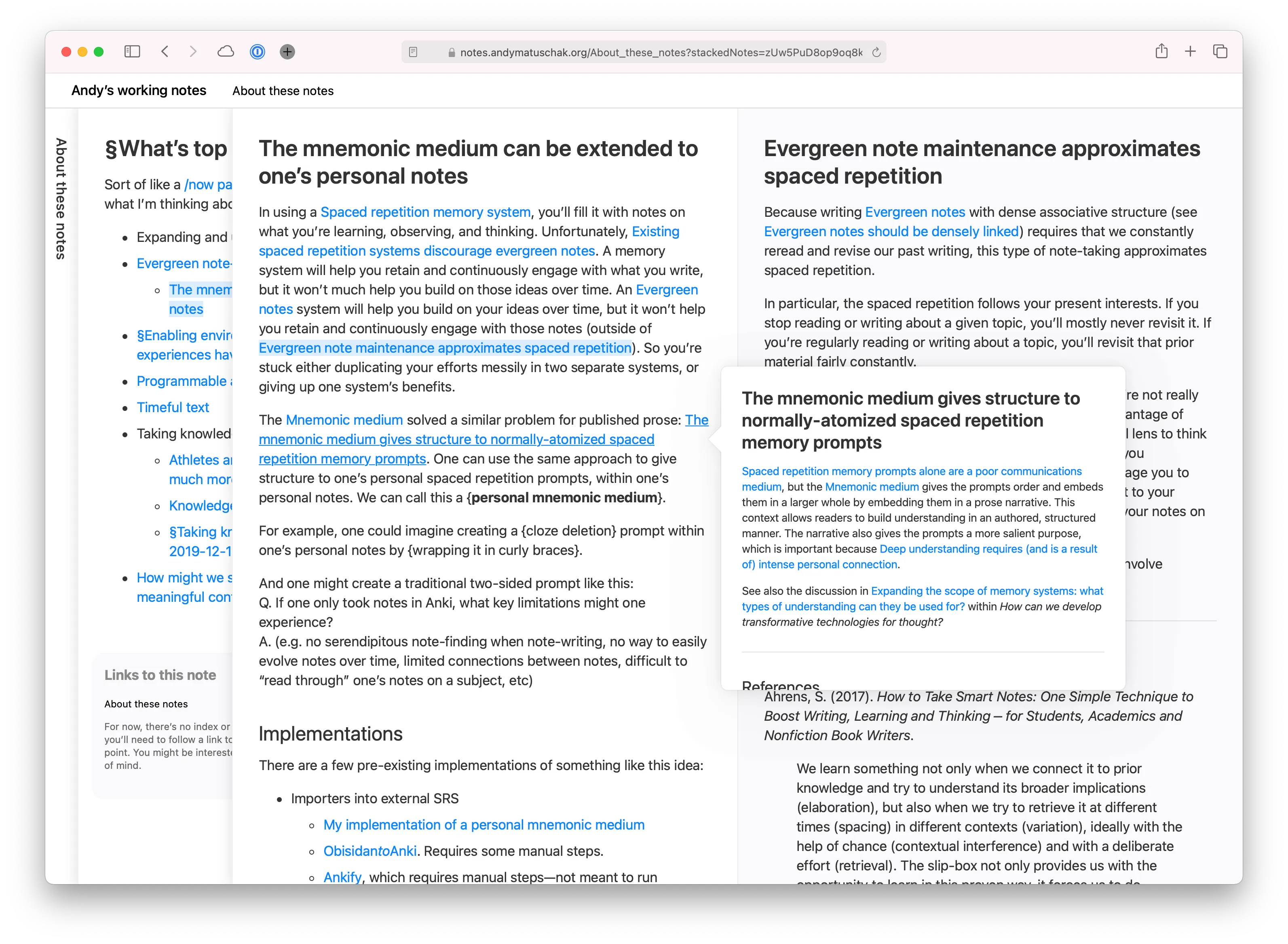
While this view is impressive, it may not be all that useful. I’d like to see something more like Andy Matuschak’s site applied to a design system:
Here, when you click on a new link it is layered onto the previous one. You can easily visualize the path you took to find a certain concept, and can view all of the related material that led you there side by side. The specific order is encoded in the URL as well, meaning you can uniquely share this path through the information with others.
Fragments
One of the most fascinating things to me as a kid about the periodic table of elements was that the way the table was organized told us about the existence of certain elements before they were ever discovered. We knew there should be something in the table at specific places, and we even knew certain properties of the elements that would eventually live there.
Design systems are similar—there are many concepts within our systems that do not exist, and yet we know that they’re there and that they will exist in the future.
Knowledge graph apps like Roam and Obsidian let you create a new object in your graph by simply naming it and linking to it. This creates what I’m calling a “fragment” here, an object in the system that is essentially undefined beyond its existence.
The creation of red links prevents new pages from being orphaned from the start. Good red links help Wikipedia—they encourage new contributors in useful directions, and remind us that Wikipedia is far from finished.
I believe that fragments and red links in design systems could be an effective tool for encouraging contribution: “Here’s a thing we know we need, it’s been identified but hasn’t been designed/developed yet. Want to help us add it?” Having a list of fragments at the very least gives you a good backlog of content to create for your system.
Queries
While this may be more of a application of knowledge graphs than a direct feature of them, it’s a powerful concept demonstrated by Roam Research’s query feature. In Roam, you can create queries for concepts in the graph using complex logical operators. The results are transcluded into the page where the query is performed.
This concept, if applied to documentation, would allow the user to query the knowledge graph that is our design system. For instance, a designer might want to query icons AND (onboarding OR first use) to see all of the icons in the system used within onboarding and first use experiences.
I’d love to see a future where, instead of browsing a documentation site to learn about a design system, we could ask questions of the system and receive answers and relevant resources immediately.
Shopify’s Polaris design system gets at this idea a bit by exposing a GraphQL API for their design system content including pages, design tokens, components, examples, and more. While their API is targeted towards creating documentation sites, Figma plugins, etc. it would be interesting to see this API exposed directly to users as an interface for the system.
Roam’s white paper gives a good description of the benefits of representing information as a knowledge graph:
Users can connect similar ideas in multiple overlapping hierarchies, remix them without overwriting the original context, and selectively share parts of the graph with others to collaborate on specific sub-questions.
Imagine documentation that allows your designers and developers to connect, remix, and share parts of your design system. Opening up that knowledge graph to contributions is a whole other world of possibilities on top of simply providing great documentation.
Design system docs take the form they do today because that’s what our current tooling is designed to produce. Creating a custom site with the features and authoring experience of something like Roam, Obsidian, or Notion is no small task, and simply using one of those tools directly will mean you’ll miss out on lots of other custom features that make good documentation great.
Still, there are surely ways we can take these ideas and be inspired by them when designing and building design system documentation in the future. If you have any thoughts on that or have seen any relevant examples, please let me know.
The songs of summer begin. Frogs start their singing, and birds chirp in the forests. Worms surface from underground, bamboo shoots begin to sprout.
Summer is slow to arrive here in Chicago, but I’ve received both doses of the vaccine and that feels pretty great. Here are some things I’ve appreciated lately.
A new project from Brie Wolfson called The Koolaid Factory is a series of zines about the ways organizations coordinate, collected in the form of a beautiful website.
While exploring the site I discovered that the illustrations for the project were done by Leila Register, who I then learned also does art for Chicago’s Hopewell Brewing, which is a neighborhood favorite of mine.
Small world.
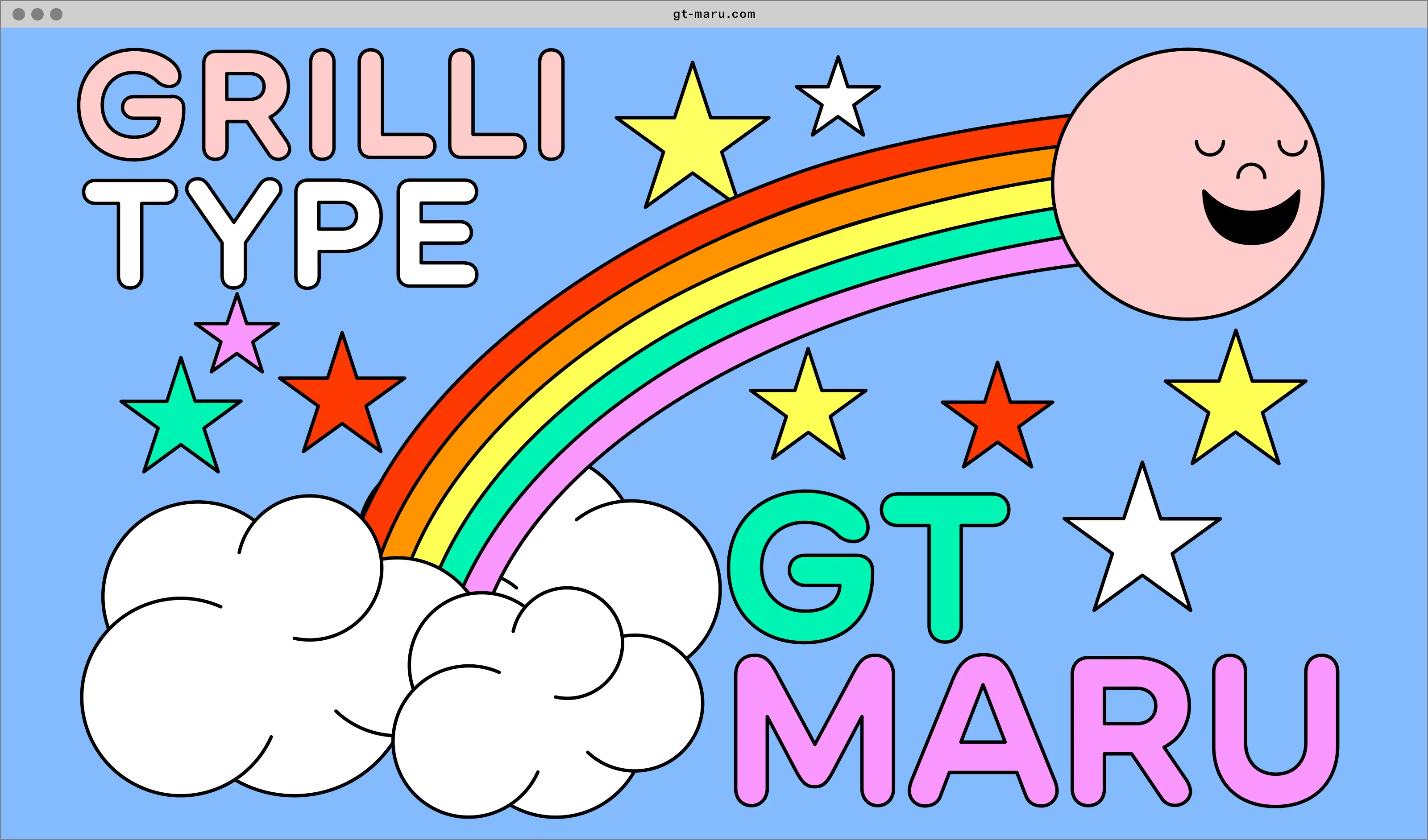
GT Maru is a new typeface from Grilli Type that’s inspired by the wayfinding signage of Japan. Let’s ignore for a moment that this is a fantastic typeface, which it is, to acknowledge the wonder of the “minisites” that Grilli creates for their typefaces.
Just the concept of a minisite is great. By what measure is this site smaller than others? By the amount of pages within the site? By the narrow purpose that the site serves? What would the web look like if websites were organized by size and shape?
I’m generally a sucker for a good space story, and during the past year I’ve noticed that alternate history fiction has been especially comforting. The Apple TV show For All Mankind is the intersection of these two, and its recent season 2 finale was particularly great television.
The finale managed to weave many divergent plot lines together in a really satisfying way, which I feel many shows struggle with. Vox calls it the best TV episode of 2021 so far, and I feel as though I must agree.
Svelte is a web framework which I don’t often use but like to keep my eye on. They recently shipped a new feature outlined in RFC 13, titled “Passing CSS custom properties to components”. The feature allows you to set CSS custom properties on Svelte components with a dedicated syntax:
<Component --myCustomProperty="tomato"/>
I love this. The syntax so clearly harkens back to CSS by using the double hyphen signifier that it almost feels like a part of HTML itself (something I appreciate in other Svelte idioms as well). This would be immensely useful in regular HTML, and would avoid us from needing to write inline styles in order to set custom property values.
Like many other kids in my generation, I loved Pokémon when I was growing up. That shouldn’t really be a surprise—the entire concept is built around gamifying ecology (albeit, a fictional one). It makes you wonder if we missed an opportunity to take the same approach with our own ecosystem.
ASH is a project from a studio called FINH that wants to do just that by creating a Pokédex-like device that can provide (using AI) information about the world around us, simply by pointing a camera. The video for ASH points out that “we can’t protect what we don’t know.”
ASH seems to only be a concept at this point, but I’m keeping a close eye on it as I’m generally fascinated by technologies that help us build a stronger connection with a physical environment rather than a digital one.
Speaking of projects using technology in wholesome ways, I’d like to briefly mention hyperlink.academy, which is a platform for creating and participating in online courses created by folks from the community. The types of courses offered on Hyperlink are incredible, very online, and range a huge spectrum of topics. Here’s a few running at the moment that stand out:
Speaking of newsletters, one of my favorites of late is an advice column from Heather Havrilesky called Ask Polly. Heather’s writing is captivating and at times heart-wrenching. I really admire how she goes right for the jugular every time.
It’s incredibly easy to create a simple website with a few basic tools, even though the current state of front-end development might have you believe otherwise. That being said, creating something that is uniquely expressive and free form is not so easy without more CSS experience. Enter mmm.page.
The creator, XH, has made a wonderful tool that is completely free-form, while still ensuring that sites work even on mobile devices. You can have the awesome webpage in your head live on the internet in minutes. Highly encourage you to give it a shot.
P.S. the homepage for mmm.page is at build.mmm.page, which is just great. Every time I see it, I read it out loud like it’s a statement—“build ‘em page.”
Working on the internet in 2021 is really hard, and it’s getting harder.
The past year has introduced us all to new routines, new ways of working, new forms of anxiety, and new sources of grief all delivered via the web straight to our periphery. On top of that, we’ve also seen the increasing commercialization of online spaces in recent years. Instagram no longer feels like a place for sharing photos with friends, it feels like a venue to monetize your brand and commodify the attention of others.
The times we find ourselves in have only accelerated the degree to which we are turning to the web to find connection, do our jobs, and spend our time. I personally love the web, and have chosen to build my career around it—but even if that wasn’t true I wouldn’t be able to escape this new, frequently virtual reality.
Despite my love for the web, I’ve realized that the time I spend online today is frequently more draining than it is nourishing. Moments that I would prefer to spend creating and learning are instead spent comparing my output and value to someone else. And when I say “spent”, I mean it more literally than you might think—this is what we pay when we pay attention. When we choose to give energy to things that don’t serve our goals we are trading against our own creative well being.
Technology is supposed to exist to serve humans and human goals. But increasingly, so many of the technologies that we rely on have goals that are counter to our own—the primary one being engagement for profit’s sake. Tech companies don’t care whether our engagement is in pursuit of a personal goal, they only care whether they can sell that engagement to advertisers. Our technologies have their own agenda and definition of success that is frequently at odds with our own. So many of us are now beholden to something that was meant to serve us, not the other way around.
I’ve been struggling with how creatives are supposed to thrive in this environment, and how we might separate the web that connects and nourishes us from the web that is trying to profit off of our distractedness. If this truly is an attention economy, how can we engage with the web without paying a toll in the only currency that is truly required for creative work?
And to be clear, I don’t think this is just a problem on the web. So much of our value today is derived from what we produce and share with the world, often done in order to justify some mysterious idea of a “work ethic” in a society where production is seen as a goal unto itself.
But a creative who judges the value of their work by what they produce and share with the world is missing the point. The “why” of our work is in the process, not the result.
I’m writing this because I need a reminder for myself, and maybe you do too, that our creativity is fickle and doesn’t work at the pace of the internet, and that’s okay. The real value is not ultimately in what we create—it’s in the space we carve out for ourselves to be creative, and the things we learn about ourselves and the world within that space. And yes, that includes all the struggles and tensions that come along with the work.